Search
Etihad Rail Network - Part of the Gulf Railway
Etihad Rail is one component of the Gulf Railway that will connect: Oman, UAE, Qatar, Bahrain, Kuwait and Saudi Arabia. So far it is the only part that is completed. Each country is responsible for its length of the railroad. The Arabian Gulf region is the least populated part of Saudi Arabia and therefore the Saudi length of the track is a low priority for the Saudi government and work is scheduled to start in 2026.
The evolution of Paris through historical maps (sources in comment)
A selective superposition of important evolutions of Paris' city limits. Based on this animation video on the evolution of the limits of Paris, from Roman antiquity to present days.
Sources :
- Nicolas Delamare, Traité de la police, Paris, chez J.Cot, 1705 : “Second plan de la ville de Paris” ; “Troisième plan de la ville de Paris”, par Antoine Coquart
- Plan de Truschet et Hoyau, 1553
- Plan de Jean Delagrive, 1728
- Plan d’Alexis Donnet, 1837
- Satellite picture of Paris by Sentinel-2B, ESA, 2018
Most of them are available in very high quality on the David Rumsey cartography center.
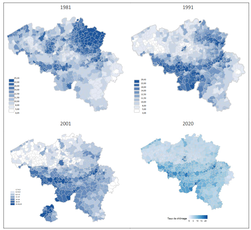
Unemployment rate in Belgium (2020)
In the map it can be clearly seen that the unemployment is higher in Wallonia than in Flanders. This is largely due to the fact that Wallonia has historically relied on its heavy industry, such as steel and coal, which has moved abroad the last decades. In fact, the Sambre and Meuse valley which was the industrial heartland in Belgium thanks to its coal resources, can be clearly seen on the map.
It is also interesting to see how the distribution of unemployment has changed throughout the years, as seen on these maps: !
2024 Indian Parliament election results - Maharashtra
Cyan - Congress (13 seats), Green - SSUBT (9), Orange - BJP (9), Pink - NCPSP (8), Yellow - SHS (7), Blue - NCP(AP) (1), Grey - Ind (1)
The shapefile is from the Election Commission of India website.
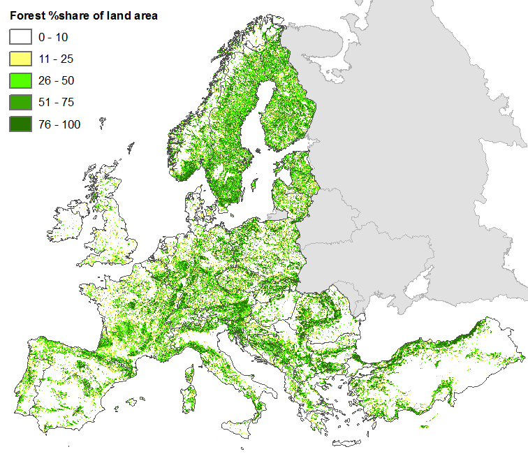
Habitat suitability of European forest categories
More info about the map and the forest types here. The forest types are described in chapter 6.
The map does not necessarily show what kind of forest actually grows in different places, if any, but rather which forest type you could expect to find there naturally, if it would be forest. But it probably matches reasonably well with what actual forests look like, although most of Europe is of course not covered by forests.
Here's a map over forest cover in Europe:
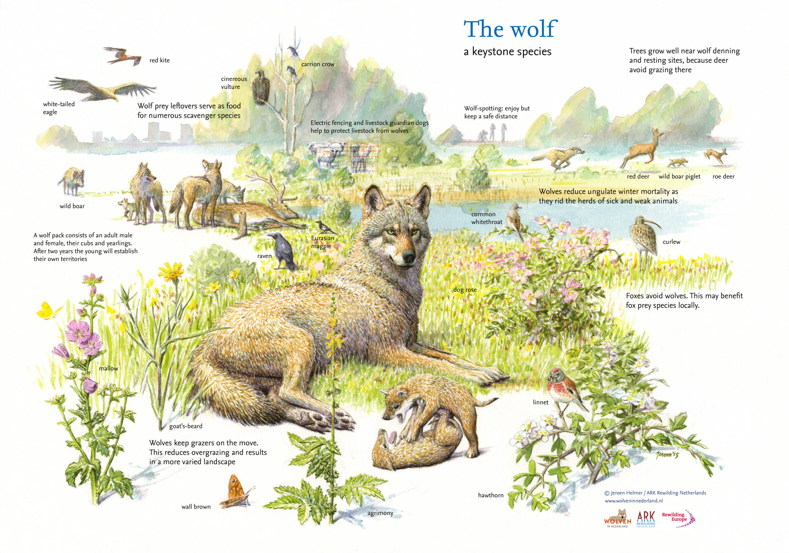
The decline and recovery of the European wolf population from 1800 to 2018 (no data for Russia and Belarus).
Map is a bit confusing since it has no data for Russia and Belarus, but there are wolves there. Here is another map with population numbers as well:
Also, pretty infographic about wolves from the same source:
The Only Difference Between A Map Enthusiast And A Mapping Enthusiast Is ing
I recently learned that the Mormons settled and resettled in several states before finally staying in Utah. It's quite an interesting story, especially given that most religions are so ancient that it's very hard to track their origins today.
Johnny Harris has great videos about it, this one for instance.
Eckert IV is mine, which is quite similar visually. It has the upside of being equal-area, but the downside of squashing the poles a bit more. Sadly both of us suffer the injustice of being excluded from that one xkcd comic
Never heard of this, interesting. Thanks for sharing
They fixed it in the meantime
https://www.perrinremonte.com/expe-eng?itemId=m21a3at8pndyfg97b4lgs89eem8gg4
They're in spring right now, and Tazmania is below freezing and snowing in some areas literally this very moment. So I guess it does. It is VERY far south, almost as far south as the tip of Argentina.

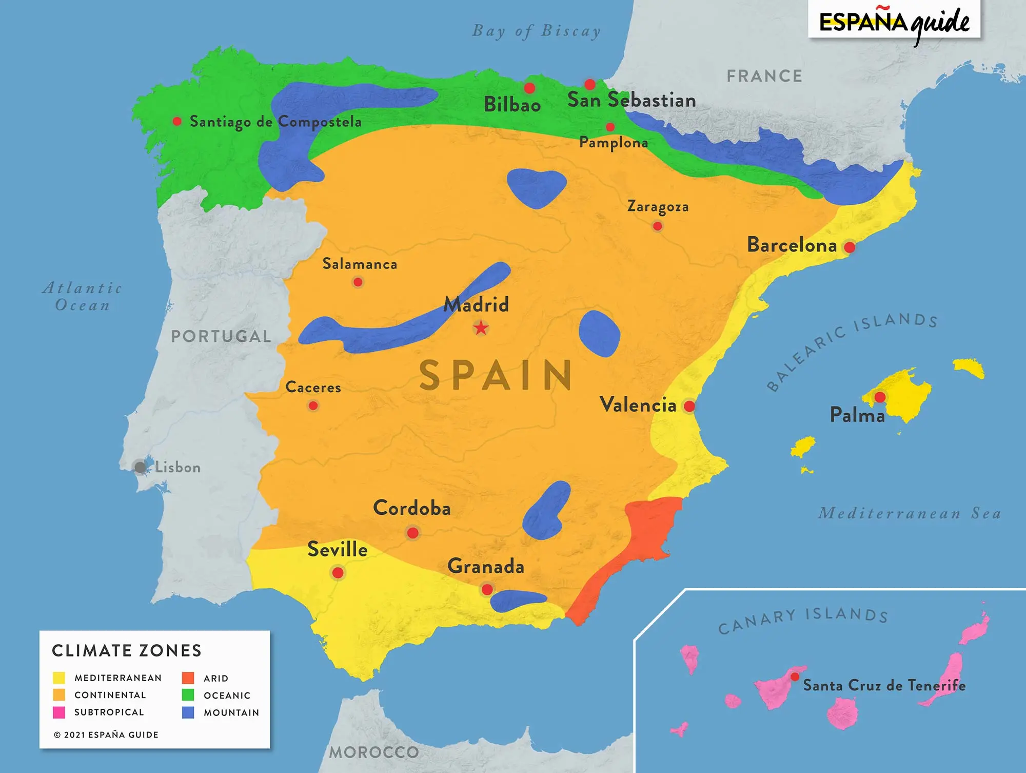
Not necessarily. look at what Spain has in an area a bit smaller than Texas.
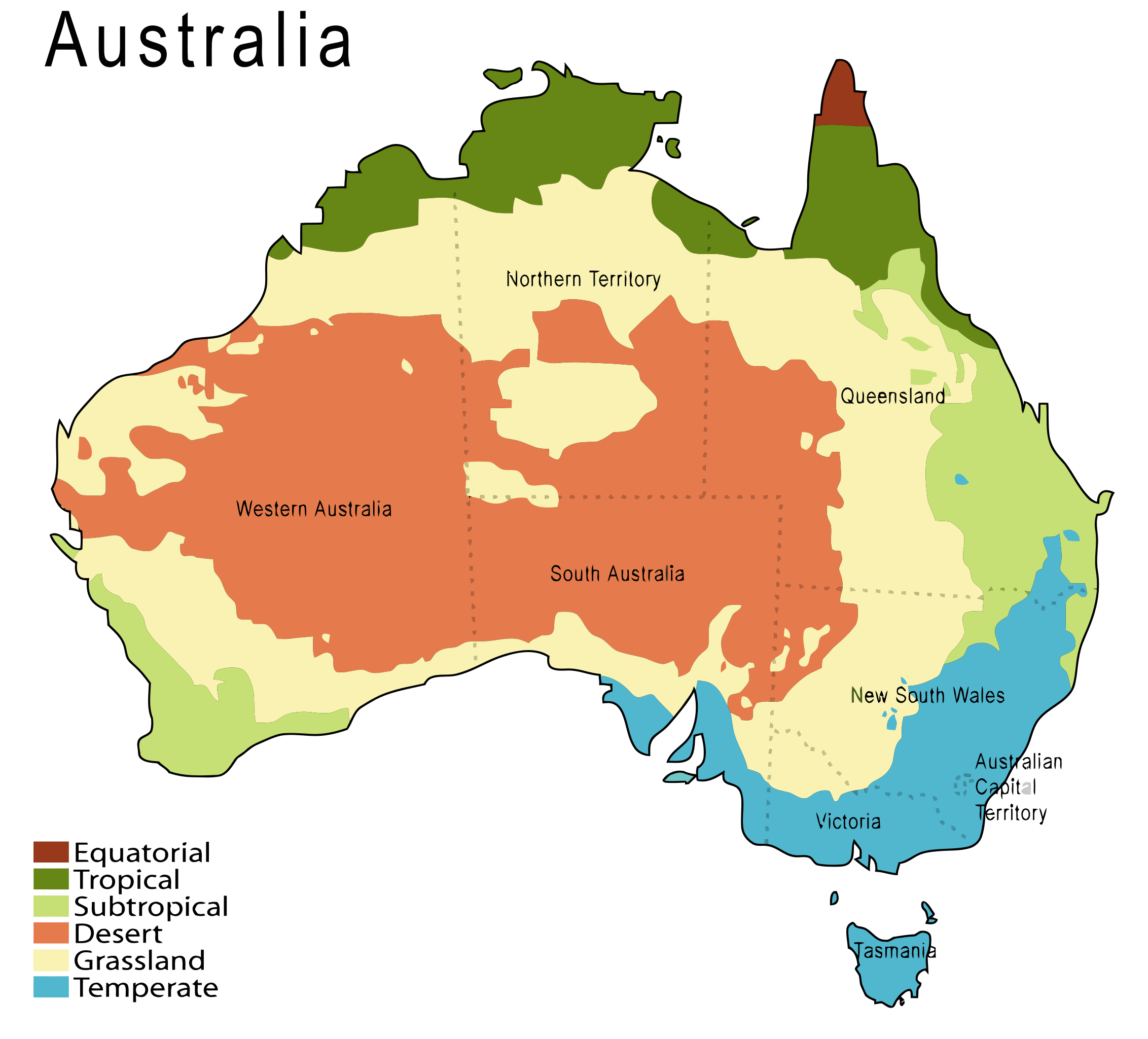
You’d be wanting this shitty map. Congrats now you know Victoria is temperate, what it doesn’t tell you is that we’re often wet and miserable like in England or that you’ll get snow in Tassie.
I much rather OPs map.
Check out the vegetation zones of Washington State. Oceans and mountain ranges have a massive effect on climate zones.

Maybe one day I’ll get a Cahill-Keyes projection on the wall. I think it’s useful to see how surface areas compare.

This one has been mentioned a few times: https://en.wikipedia.org/wiki/Kavrayskiy_VII_projection

And no projection is perfect they all introduce weird things, like this equirectangular map which is not conformal or equal area.
What you see in stuff like Google Maps or OpenStreetMap isn't plain Mercator, it's a variant called "Web Mercator"
And the US DoD doesn't like it because it introduces even more deviations than plain Mercator.
Ah, I see you're that kind of map enthusiast, eh?
Edit: I see you've already posted it yourself. Not an original bone in my body.
I kinda like the Kavrayskiy VII projection. It's similar to the Winkel triple but it looks more natural to me, like a 2D Google Earth.
I wrote a similar comment under a similar post here.
I don’t know if it’s considered better to link or to quote an old comment.
Those are surprisingly large zones, I would have thought it would be much more fractured. Is it just a rough generalisation, or would someone in Mauritania speak similar to someone in Algeria?
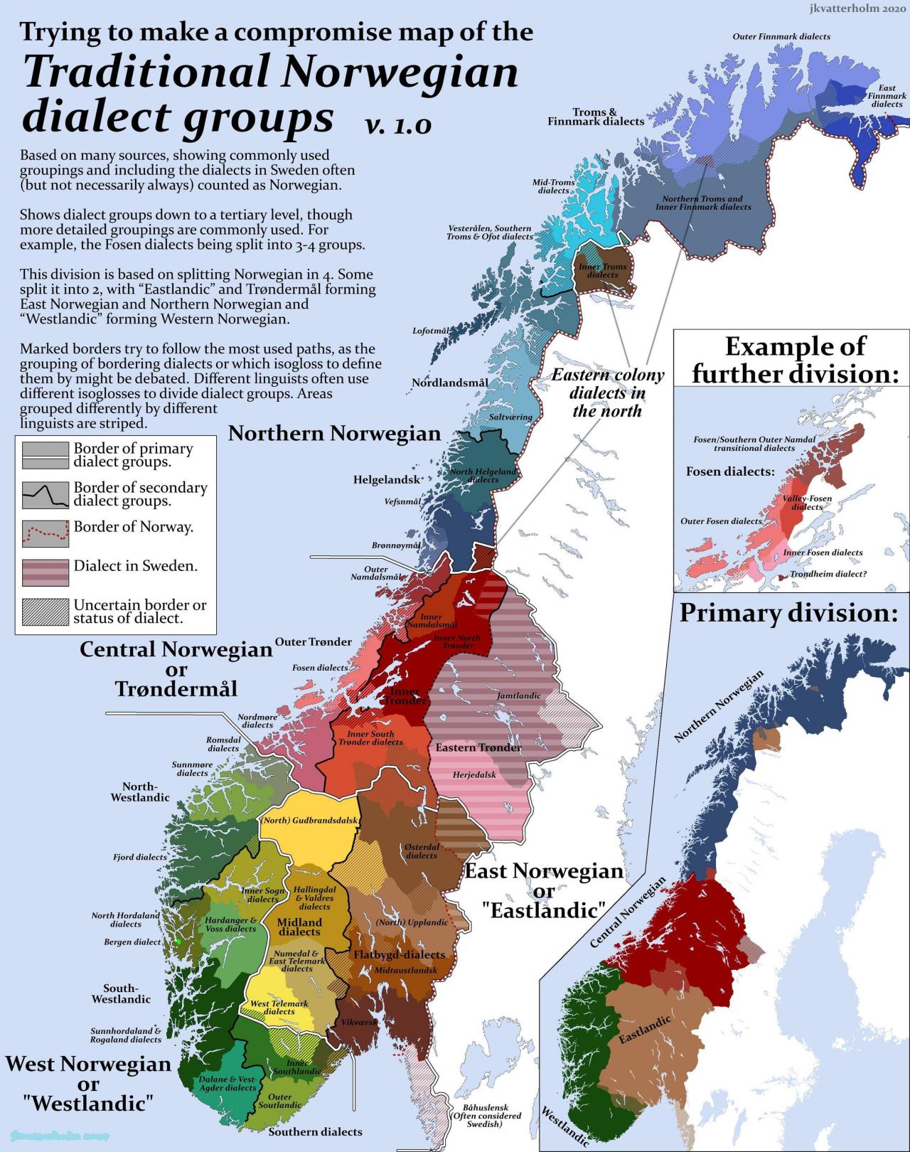
Even this map of Norway doesn't really represent all the dialects in our tiny country.
There's another observance on the first of May I learned from Jonathan Coulton
It's kind of subtle how exactly you're using numbers when writing limits. You're either not actually doing infinitesimals, just Cauchy sequences centered around a point, or you are and you get to enjoy the axiomatisation of the hyperreals.