End of an era: Nova Launcher's parent company lays off practically everyone
End of an era: Nova Launcher's parent company lays off practically everyone
Layoffs have reduced the Nova Launcher from twelve members to just a single one man team. What does this mean for the launcher's future?

So, anybody know a good launcher to use once Nova goes offline?
You're viewing a single thread.
After getting a replacement phone, I had to redo everything. I decided to check out some new options. I have nova prime and have loved it.
I am now using Niagara Launcher. It's different. Very different. The team recommends using the app for at least a week to give it a true test run. I did have my doubts because it's so different but dang do I love it. I haven't switched back and I don't mean this to throw shade on nova. Nova is great, but I like this better.
Instead of thinking of ways to change the launcher, they created a whole new launcher as if they didn't take into consideration the current way we do things.
Give it a shot.
https://play.google.com/store/apps/details?id=bitpit.launcher
I second that! Been using it for ~4 years now and I so much prefer it to the old launchers. After installing it I completely stopped testing new launchers.
Does anyone still remember the old (2010) launcher called slide it. Unfortunatly it was discontinued and I have always been searching for an adequate replacement. In Niagara I have found it.
Anyway, back to why i like Niagara so much. With every other launcher the workflow is like this:
- swipe up for menu
- swipe 2-5 pages left or right till you reach your app
- click your app icon
which takes ages and is tedious.
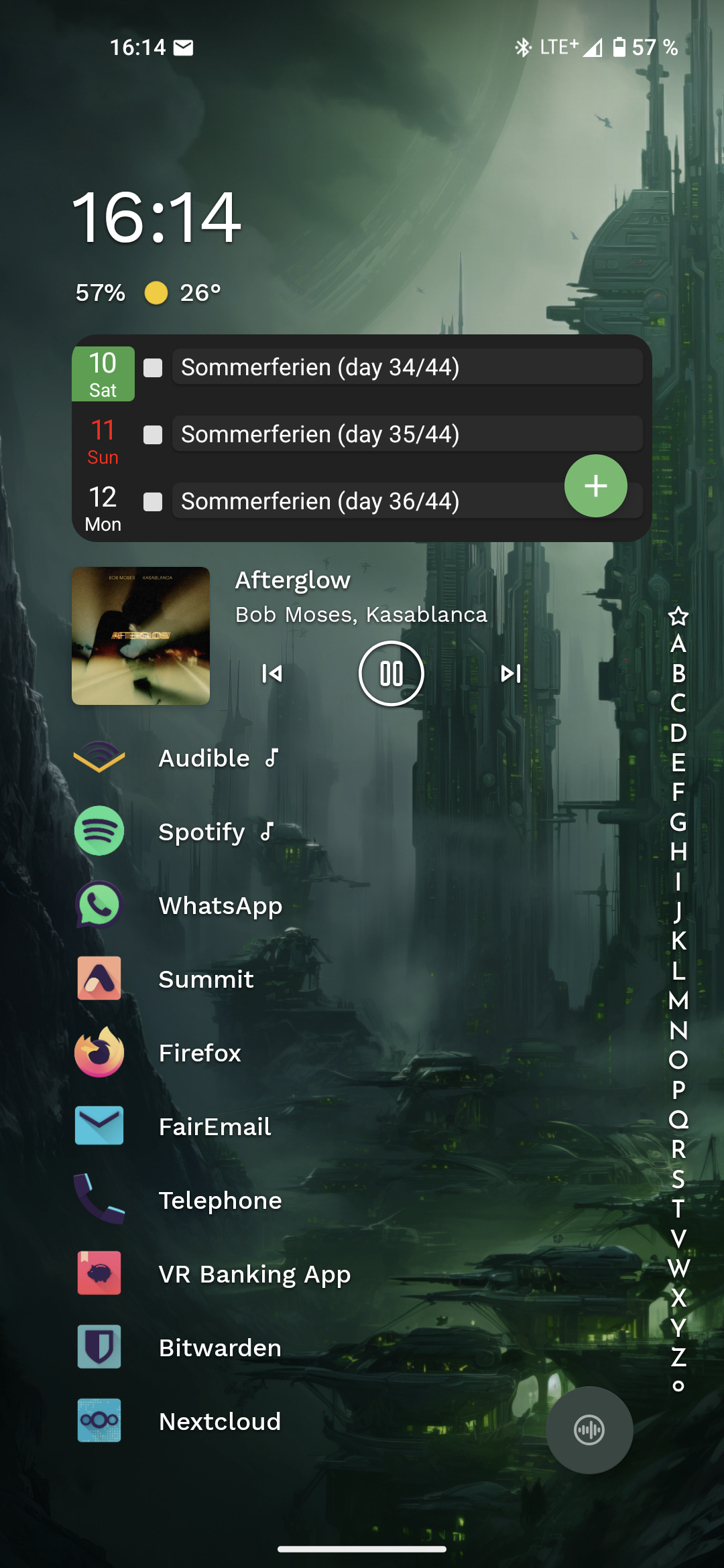
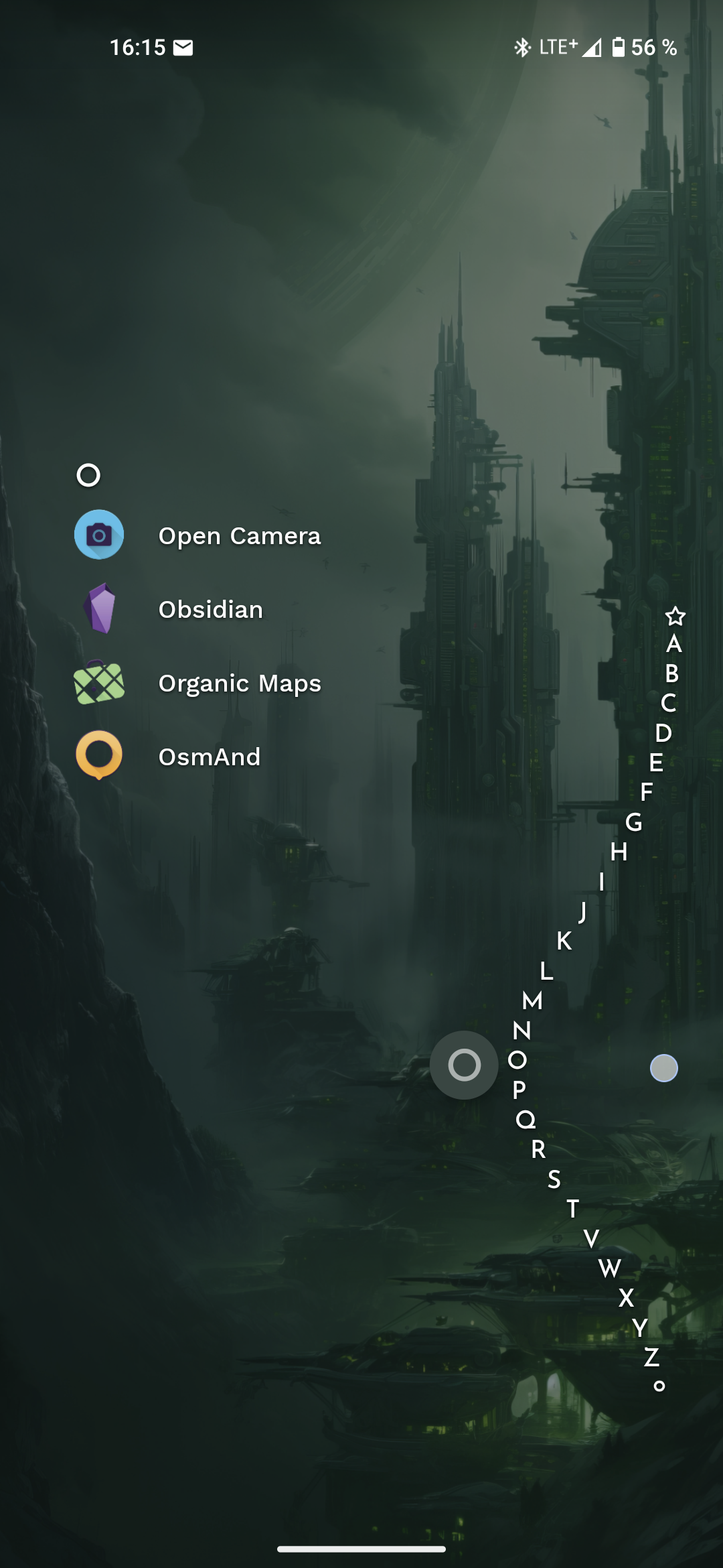
On Niagara I just swipe along the left or right edge until the letter my apps name is starting with appears and click the icon. That's it.
Having notifications beneath your favorite apps and an included media control app when audio is playing is superb. (I'm using the pro version). Calendar is aCalendar btw.
Best few bucks I have ever spend for some android app.


Oh man I wasn't prepared with the price. I think it's either like a few bucks per month OR $30 for life. I did the trial for the full version and canceled it so it wouldn't reoccur. I got to keep my calendar on the home screen but every other premium feature is locked out... I've been OK with it.
Wow, thats expensive, wasn't aware it got that expensive. I bought it for 5 bucks or so a few years ago.
To be honest, I would still pay, if I hadn't already, it's that good.
Your wallpaper is gorgeous! Mind sharing the source?
That wallpaper is one of the wallpapers that comes with the Niagara launcher!
I keep hearing about Niagara and everyone says the same thing, it's different.
Could you describe how it's different? Just the setup, or is it different when you're using it?
The whole concept is different. I've just started trying it and the gist of it is that it's basically only the app drawer, but on steroids. There is no home screen to arrange, you simply set favorite apps that show up first. Anything else you select by scrolling through the alphabet, which seems quick enough if you know the app name you're looking for.
I can already tell that I would love it more if favorites were redesigned a bit to use the initial space better. But this would betray the simplicity they are trying to achieve.
So you can set up some options. I have mine set where I can swipe up or down on left or right side and it pulls up this like.. Rocket dock alphabet which you can find your apps. The whole thing, as another user posted, makes it so you don't need an app drawer or a home screen. The home screen is your favorite apps. You can view messages if you set messages as your favorite app. Same with emails or discord etc.
I switched to Niagara when Nova was bought out. I've tried other launchers in the meantime, but once I got used to Niagara I never wanted to go back to a "normal" launcher.
Is that the one with a sub? It better give daily dopamine for yet another sub.
It can either be sub or one-time. The one time is like $30 though which seemed crazy to me but... Idk the creators did work and there's no ads. I'm using the free version.
It's a one-time purchase.
edit: It's a one-time purchase for the "pro" version. I've been using the free version for a while and really enjoying it. I've been thinking of upgrading more to support the developers than for the added features.
It's a choice of subscription or one time purchase
My bad then! I just saw options for a trial and a one-time purchase, didn't realize there was a subscription.
Honestly glad to see the option. I'll take a one-time purchase any day.
