 micahmo @programming.dev
 https://github.com/micahmo
Contributor to Thunder for Lemmy.
Glad you like it!
This feature is now in development for Thunder!
Hey, thanks for sharing this! We now have a GitHub issue open to track the two small things that Thunder failed. Nice to see it did so well, though! :-)
Hey, thanks so much for the response! It's incredibly useful to hear real feedback like that, and I appreciate the time you took to write it all up.
I think it's been a couple months since I had seen an update in fdroid, which is usually my signal to check out the latest.
Fair enough, this latest release cycle has been a little slower, but there is a new update coming soon. We're also working on putting pre-releases on F-Droid in a different channel for those who want to be on the bleeding edge (the pre-releases come out much more often).
Multis would be amazing.
I assume you mean multi-communities, where you can view a feed of posts from multiple communities at a time? If that's what you mean, does this GitHub issue cover your ask?
https://github.com/thunder-app/thunder/issues/13
Images would get squished in full height mode
This one has been hard for the devs to reproduce, but you're not the only seeing it. If you want to follow progress on fixes, check out this issue.
https://github.com/thunder-app/thunder/issues/1448
Clear read posts is a super useful one in Voyager, a nice-to-have for thunder
This one we do have! It's available via the Floating Action Button. By default you can long-press or swipe up on the FAB to see additional options, including "Dismiss Read". But the FAB is also super customizable, so you can make that the default action or the long-press action if you want.
Had an issue with messages, unable to reply from inbox maybe? Can't remember exactly what it was.
As part of the upcoming release, the inbox has been redesigned, so hopefully replying should work now!
Anyway, no need to respond, just wanted to follow up and say thank you again for the time and the thoughts.
Visually I like Thunder quite a bit, but it's still fairly early in their development so it doesn't have feature parity yet.
Just out of curiosity (no need to answer if you don't want to) are there any major features missing from Thunder that you'd like to see? I'm not trying to sway you back or anything (it's not like we have any incentive for getting more people to use Thunder); I'm just looking for ideas to make it as good as possible!
Thunder allows cross-posting! It should follow the web UI implementation (where the body of the new post has a link to the original, plus the original contents in a quote block).
As one of the Thunder devs, I can say there are markdown libraries. Thunder is written in Dart/Flutter and there is a great library that we use.
https://pub.dev/packages/flutter_markdown
That said, and as others have mentioned, markdown is not as well standardized and it seems like just about every site renders it differently, so there are a lot of edge cases to handle. Lemmy also has several unique implementations of things, such as spoilers, superscript/subscript, and the ability to tag users/communities without a hyperlink.
In fact, one of the things Thunder failed on (table alignment) is a known bug in the markdown library we use. :-)
Since you mentioned RDP over SSH, I thought you might be interested in this GUI tool I made to do just that.
Hi @[email protected], is it possible that you could show a screen recording of the issue you're seeing? I'm wondering if you're seeing the playback controls (play/pause/seek/etc). These appear over the video at the very beginning and have a dimmed background so you can see the controls. This is pretty standard for video players (e.g. YouTube does the same). As @[email protected] said, you can tap anywhere to hide the controls and undim the video.
We don't officially publish a build for Windows, but you can build it yourself and target Windows. Here's what the icon would look like in the taskbar. Not sure if it's exactly the same as what you saw!

Just FYI, coming from a Thunder dev, the full contents of deleted and removed contents are available via the API, and it's up to us to hide the contents. It's easy to miss use cases (like another user mentioned you can see deleted comments by replying in Sync; that's just an (easy) oversight by the dev). I'm glad to hear that they won't even be available in the API starting with 0.19.4!!
I will admit I am very biased as a contributor to Thunder. I'm not an expert on all clients but Thunder has some super cool features.
- Really good markdown rendering (I've seen it render things that the other "big" apps miss.
- The agility to post and (soon) comment as any of your logged-in accounts.
- Notifications for inbox messages, soon to be integrated with UnifiedPush.
- Really good Lemmy link parsing and in-app navigation.
- Ability to favorite communities.
- Customizable swipe gestures, username and community name formatting and coloring, action colors, etc.
And these are just some of the recent things on the top of my head! I'm sure others can chime in with things I missed!
Hey there! You can block communities in a bunch of different ways!
- From long-pressing on a post and pressing the Community option and then Block Community.
- By navigating to a community page, pressing the top banner / info button, and pressing Block Community.
- By navigating to the account page, settings gear icon, scrolling to Blocked Communities, pressing the plus icon, and searching for a community to block.
There may even be some more ways I'm not thinking of. Plus if you block a community via the web UI or any other app, Thunder should respect that.
Let us know if that helps!
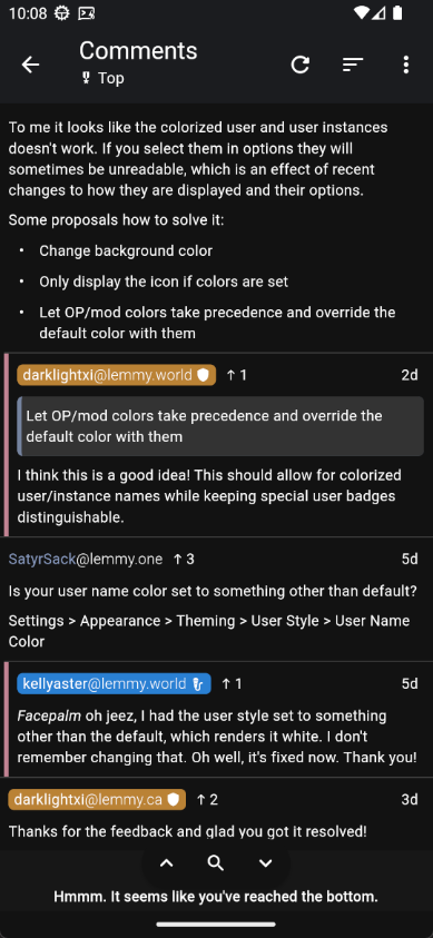
Let OP/mod colors take precedence and override the default color with them
I think this is a good idea! This should allow for colorized user/instance names while keeping special user badges distinguishable.
Just chiming in here to say that this has already been implemented in the current prerelease and should be available in the upcoming general release!

That's great, I'm glad to hear the haptic feedback in Thunder works when the system setting is turned on.
To be honest, it feels like the right behavior for Thunder to respect the system setting. I personally keep "Touch feedback" turned down, because I do not like haptic feedback, and I'm glad Thunder and other apps respect that. I tried Voyager, and you're right, it seems to override that setting, which doesn't seem like a good thing to do. :)
Let me know your thoughts, and whether it's an acceptable solution that users will need to enable haptics in system settings in order for it to work in Thunder. Thanks!
This isn't yet supported from the account page (it should be at some point), but there is a workaround. It you navigate to your user profile elsewhere in the app, for example by searching for yourself or tapping your username on a post/comment, then scrolling should hide the banner as you expect. Hope that helps!
Hey, just chiming in here to say that I do get haptic feedback on my physical device (Pixel 8 Pro) when using swipe gestures on both posts and comments.
Make sure this setting "Touch feedback" is turned up.

If you're still having issues, you're welcome to open a GitHub issue (or ask someone here to do it for you), but it will likely be hard for us to investigate if we can't reproduce. :-(