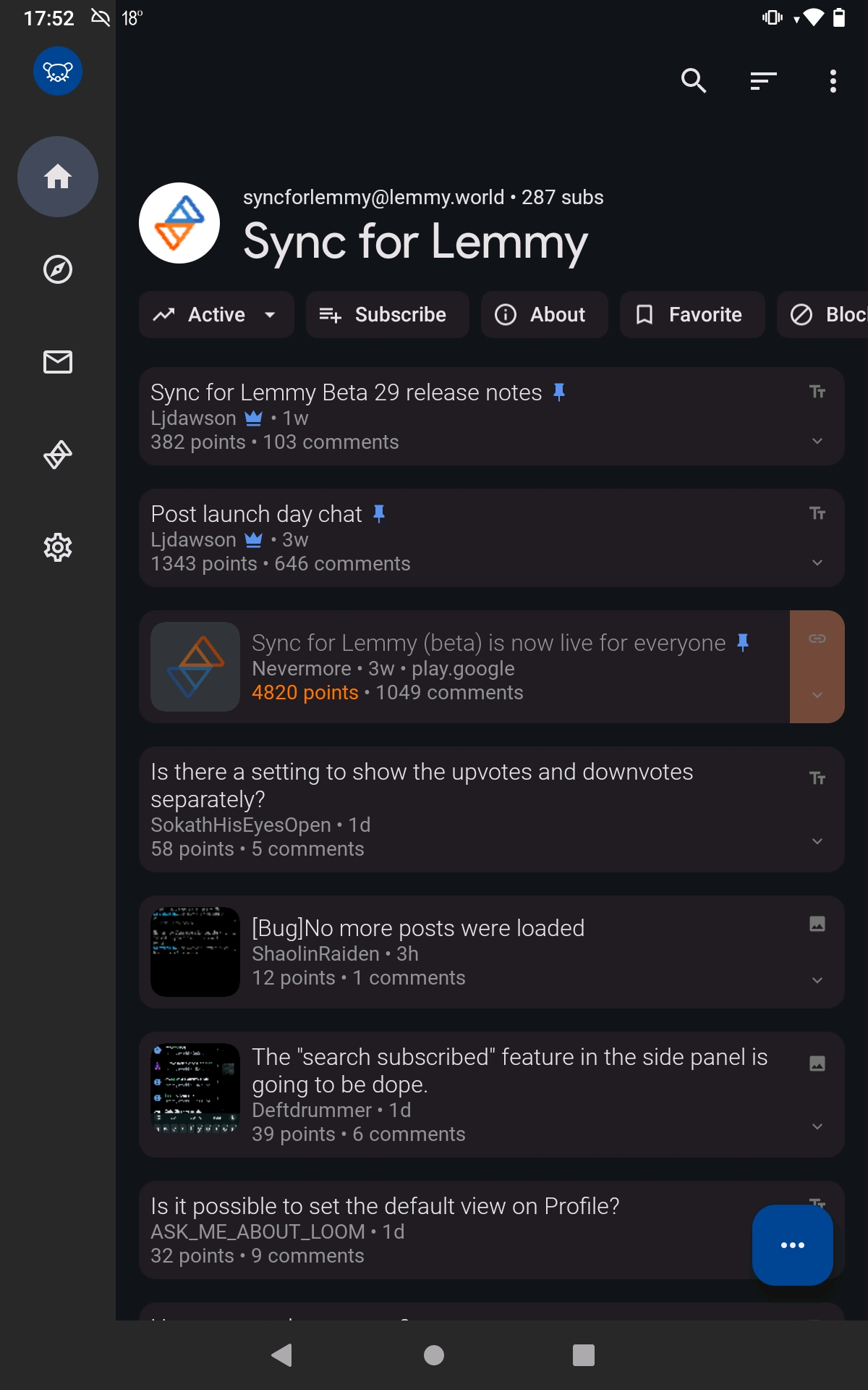
Why all this unused space at the top?
Why all this unused space at the top?


It seems that space would be perfect for the community title. If the title's too long, it could be truncated with horizontal scrolling.
Edit: problem solved!
I didn't like it either. Luckily you can disable it in settings; Settings shortcut: General > Expanded Toolbar
32 0 ReplyOh! Problem solved, thanks!
9 0 Reply
IIRC that space is a standard design attribute of Android's "Material You"
25 0 ReplyPreviously on Sync, that space was used for subreddit banners, but I'm not sure if many Lemmy communities use a banner.
6 0 ReplyDesigners, smh. Gimme a tiling Lemmy manager with maximum efficiency via keyboard only bindings.
9 9 ReplyYou carry a keyboard everywhere you take your phone?
3 0 Reply
So you can reach the top one-handed
19 1 ReplyWhy ... are you using lemmy... one-handed? ( ͡° ͜ʖ ͡°)
11 10 ReplyI see we really did bring the Reddit jokes to Lemmy
8 2 ReplyLenny face on lemmy. Heh.
1 0 Reply
A bit of space is nice sometimes, especially around titles
17 1 ReplyThat's a lot more than "a bit," and spacing above titles only really makes sense when there's content above it. This just suffocates the space available for the scrollable content.
3 9 ReplyAll part of material design

24 0 Reply
IMO it's a non-problem, because it's not permanent, it dissapears if you start scrolling and enables you to reach it with your thumb
12 2 Reply