[WIP][v1.27.0] Filter comments
[WIP][v1.27.0] Filter comments
This release adds comment filters.
Changes so far
- Fixed a bug where the inbox screen can end up in a weird state and the bottom navigation bar would hide when it shouldn't.
- Added comment filters.
- Limit the app to only one (1) task per profile (eg. work profile). This addresses some edge cases.
- Fixed a bug where UI shows old comment when a comment is updated.
- Added Controversial and Hot (scaled) to the list of possible sort orders for account defaults.
- Fixed some inset bugs on wide screens (eg. landscape mode on a phone).
Update
Due to the number of bugs found, I'm going to release all of the bug fixes as v1.26.5.
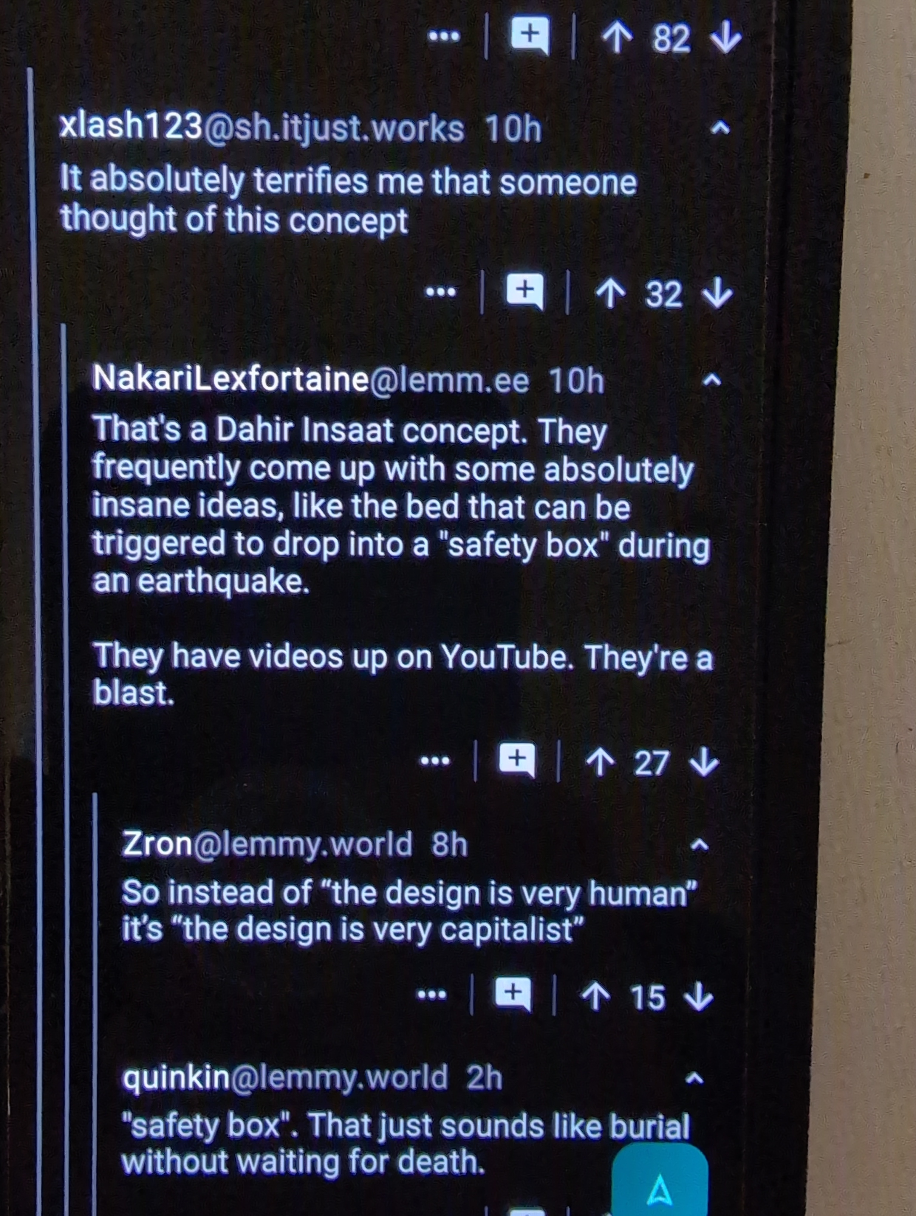
Hi there, thanks for all your work on this app! The latest major release introduced a visual bug and I was wondering if you could please fix that. Namely, adding visual clutter in the form of non-uniform coloration in the comments view.
Figure 1: Picture of a phone running an older version of the app:
 .
.Note how the comments and dividers are clean, the lines to indicate tabbing are uninterrupted, the upvote/downvote/actions bar is the same color as the rest of the backgrounds.
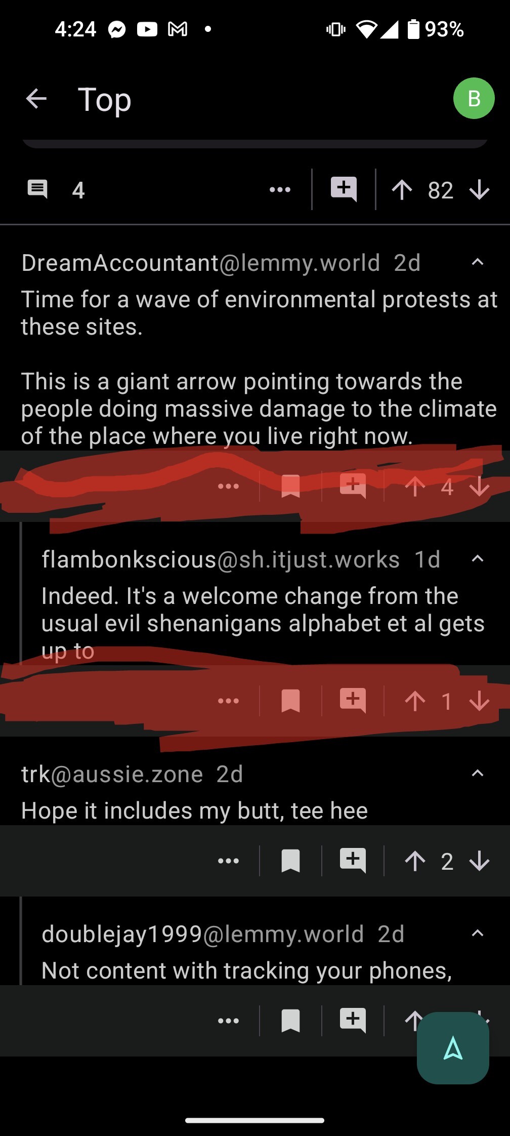
Figure 2: Screenshot from the latest version of the app. I've highlighted in red the color discontinuities, but also left 2 visible below unhighlighted:
To my eye the first picture with the older UI looks far better and is much less cluttered.
I have a fix ready. I'll release all of the fixes as v1.26.5 since I've accumulated a few fixes.
Thank you so much! 🙏
v1.26.5 should be out. Can you confirm it looks good on your end? Thanks!
Looks good, thank you so much!
Thank you for reporting this issue. I'll look into a fix for the next release.
Out of curiosity: do you have an example that looks especially weird? I haven't really noticed before but you stating that I maybe know what you might put a limit on.
Before
After
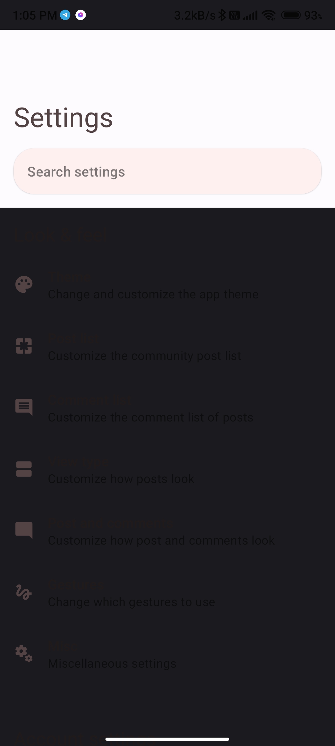
Am I an idiot, or wasn't there a setting for multiple column views?
Do you mean large screen support? Currently there is no way to force it on. The app measures the screen spaces and determines if multiple columns is appropriate. If you want this feature let me know and I can add it to the to do list.
Ahhh, gotcha. I have switched tablets recently, so it might be the difference.
Just to confirm you mean this view right?

No, it was dual columns of posts like this
It really could just be that I'm an idiot and can't remember correctly. I'm putting together a small overview of lemmy apps for the family website, and was comparing features, and could have sworn summit was one of a few that could do that.
Hi, the app is almost unreadable for me when using the light/automatic theme:
I also have noticed you can't choose the scaling sort type as your default one, unless you have it on by default in your Lemmy web preferences (set up outside the Summit app).
I think both issues have been around since some previous versions.
I can't reproduce this issue on light theme or automatic. Could you share what setting you have on? A quick way to do this is to go to Settings > Import and export settings > export and choose copy to clipboard. Then you can paste your settings here or DM me. I'll look into the default sort issue.
I figured it out. The app was applying the black theme regardless of which theme is used. I'll fix it in the next update to only apply it when it's a dark theme.