You're viewing a single thread.
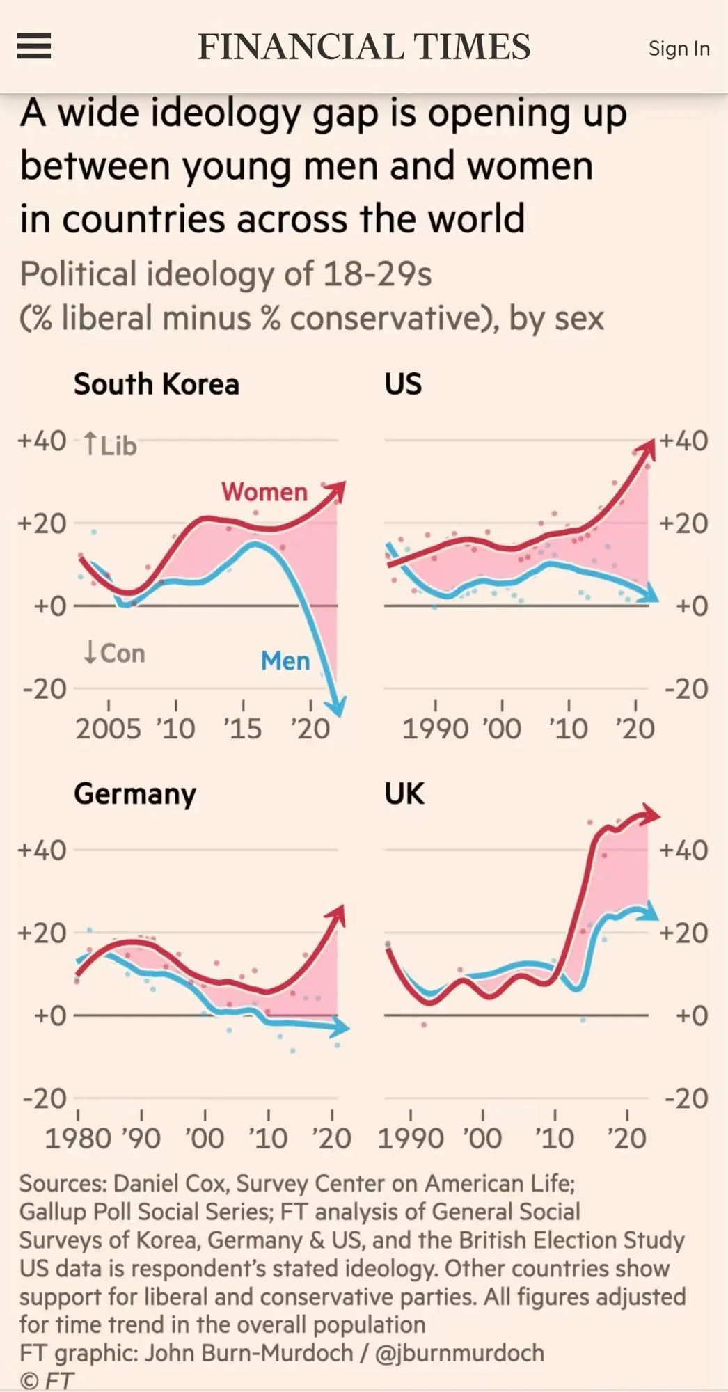
I don't know about beautiful data. That's scary data :/
123 10 ReplyIt’s only beautiful in that is well visualized. The data itself is scary.
31 5 ReplyThe graps don’t represent the same amount of time while they are there for comparison. I wouldn’t call that well visualized.
19 1 ReplySouth Korea is expanded, which reduces the appearance of disparity. Germany has an extra 10 years. But despite those issues the data is still compelling.
1 0 Reply
Do you know a community that fits?
7 1 ReplyNah, here is fine, the data is presented beautifully.
32 2 ReplyExcept the time frame is shifted for each graph
17 1 Reply+1 this. This community isn't about agreeing with the data, it's about how it's presented
6 1 Reply
No no, that's not what I meant. I wasn't trying to have a go at you. It fits here perfectly. I was just upset at the trend it was showing :\
8 0 Reply

