I thought the proposal to call them majority world countries was interesting.
I think the cheatcode in this situation provides enough drawbacks on its own. Also he has to use a lot of will and determination just to be able to use it and he's only offered it for being so brave without it
I have spent a somewhat ridiculous amount of my time working on making games smaller (it's a hobby). And have come to the conclusion that very few things make games so big: DX11 only supports textures in a somewhat uncompressed format so the CPU doesn't bottleneck load times, however vulkan has had something called basis universal which makes textures infinitely smaller and faster loading. Another thing is old formats (especially for meshes) and most importantly bad design. For example ark survival evolved can be two times smaller if you check for redundancy of files (I think their settings system for unreal assets is broken).
Doesn't latent heat change the time taken to cool? Also part of the point of a kettle being that it's 100c wheras a microwave could easily be under since it turns off based on time.
Yeah I got called a narcissist with my worst ex and then just flat out asked if they knew what it meant, I think it was a little telling they didn't actually know (not that I do either lol). It's really hard being with someone who makes you feel loved but doesn't love you and I'm so proud of you for being on the other side of it and being happy!
As everyone has said, lossless compression might not have great ratios, but if it's still worth it I recommend dwarfs as it creates read only mountable filesystems with minimal setup https://github.com/mhx/dwarfs
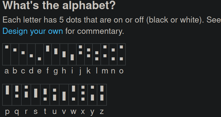
This is fantastic! The system seems pretty well optimized for your use case which is hard to do when working with something so unique, although maybe the 5 tone characters should look more different. I like really like the final look being somewhat like devanagari even if it shares none of the letters. You should be very proud of your work!
I second this! It's extremely unique and I don't think I've ever heard of a conlang where the method of articulation is so different but still very reasonable as a concept, if you're looking for inspiration I recommend silbo gomero from the canary Islands as it is a whistled form of Spanish.
Doing a bg3 campaign rn and what started as a well planned attack ended with my half orc fighter picking up a crate and hitting the last enemy so hard over the head with it the crate ceased to exist. All in all, a very fun time.
Yeah, it almost looks like you'd be able to run things faster than natively on windows, which is why I'm suspicious (not that it's a lie just that the numbers lack context). It doesn't say what the numbers represent I think?
I quite like both these characters and wish we could have them be companions, I'm still happy with what we got though and it'd be asking a lot to add such a huge amount of stuff on top of what's already in the game.
Yeah I get that it's bad but it's kinda of annoying when it's one of the only things people talk about.
I think it works really well for the goals of the language (complexity and conciseness) although I still prefer V3. A Hangul like syllable block system is cool and has it's benefits but if you're clever then an abuguida is better since it makes more recognisable words in languages like English that are less analytic. Hangul is sick as hell tho and maybe I should make a version for English.
Not a language I thought would be referenced in this topic but damn I'll take it. Maximum migraines indeed.
 Beautiful tho, one of my favourite inspirations for writing.
How would you attempt to write these symbols on paper?
! I kinda like the way this looks as it makes the script predictable but I still feel like it could really be improved
! These two are pretty bad in my opinion as I can't really tell where the dots are meant to be and it looks very overcomplicated.
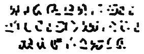
! This is the original font and I believe it can be easily written (unfortunately my artistic skill is pretty low).
wacky feature recommendations for a writing system?
I'll start with the ones I'm considering: -Clausal distinction by colour of the word -Boustrophedon (alternating direction of writing) -intent indicators
What single addition would be most useful to the English writing system?
Every once in a while I sometimes think about remaking the English writing system, as is normal I'm sure😅, and I wonder what would be the most useful revision of punctuation or phonetic.
Slowly getting through more comics with my first good script!
First panel of a few but I'm not sure if ill finish the whole comic. Translated myself so it's probably bad toaq 😅 but the fun is the journey.
theory: what if mind flayers are githyanki from the future
Been playing through baldurs gate 3 recently as I'm sure many of you have been and started to think that githyanki are really similar to the mind flayers. Both see themselves as somewhat independent but have a greater queen they serve, have a fairly utilitarian society to say the least, possess psionic abilities that are very similar to each other and long to make an inter planary empire. Now many of these similarities can be a poetic story of how they never grew or learnt from the oppression they faced, but I think that this theory adds something great to the story as they both have a mysterious origin that is somewhat explained by this, and adds a reason to why the aboleths who know all the past don't know anything about mind flayers.
was looking into reducing Titanfall 2s file size and found this
Essentially there's a huge amount of data in one of the VPK files that's being repeated and I think it should be able to be removed, I'm looking at the largest VPK file in the game btw.
Will lemmy implement veilid?
‘It’s like Tor and IPFS had sex and produced this thing’
Recently cult of the dead cow came out with veilid, a secure decentralised way of sending encrypted information and i think this could be a huge asset to lemmy. Cult of the dead cow even mentions mastadon by name as they say this is the type of application it was designed for. If veilidchat takes off then i really hope the devs will consider it.
Could someone reencode the denoised version of robocop?
I'm not sure If I'm allowed to make requests buti found a really high quality version of robocop which i love in h245 and would love to see if the filesize can be reduced in AV1. If you could do this that'd be amazing, if not thats okay too.
Look at this awesome logo my mate made!
I recently commissioned a friend to make a logo for a community I made about writing systems as an art form https://lemmy.world/c/neography and I'm super happy with his work! The title is the middle is great as a logo and the cycles of the moon show time passing along with new ways of writing being discovered. I have no idea how y'all are able to do stuff like this but stay inspired and take care of yourselves!
Just finished my first draft of a writing system specifically made for the nao language
I finally got this script to a state that I'm happy with and i think it works alright for the language. The way it works is that since every elemental word can be either CVC or CVV or CV every symbol is one consonant + the flipped form of the coda consonant on the bottom with up to three vowel marks. I hope you guys check out the nao language and keep on being kool as heck!
New logo!!
I'd been thinking that this place needed a proper symbol and I certainly didn't want to steal one from the reddit logo competition (even if they were ballin) so I kidnapped paid my artist friend to make this awesome logo that shows the different ways of writing over the ages. He's called Kriall btw and might be posting more neography related stuff in the future. I hope you guys love this logo as much as I do! Keep on arting you beautiful people I share a hobby with!
Whats your all time favourite writing system? Constructed or practiced
art by u/colin_gorman12 Personally I'm a big fan of Sindarin as it is a featural system and has a great overall design that really says something about the culture of the elves. I also think it can be written in boustrophedon which is something i love to see implemented.
What was the first language you got interested in and why?
For me it was Hebrew and it's cool writing system, then ithkuil and how alien it seems. It lead me down a deep rabbithole to where i now make writing systems.
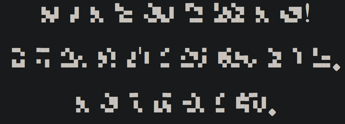
Neography review: Derani!
As this is my first real neography review I thought it made sense to do it on a conlang I know somewhat well at least in terms of community and phonotactics. Much of what I am writing here is my own opinion (it’s an art form, duh) but I hope that I can argue well enough that you’ll agree with me. I’ll go through the features and critique them as I go; as always, the sources are at the bottom of the page.
Positives The inclusion of trailing curves combined with flat stops at the sides of characters makes this script have a truly unique style online and makes things easier when less visible and easier for dyslexics as it is reported that unique additions and features to characters in a font make them more recognisable (1). The dip at the bottom is another feature which can be used to differentiate characters and words and preserves the overall style. The minimalist characters make this script easy and fast to write and don’t involve any hugely complex hand movements. The design of r and l being similar is good as it makes them easier to learn and more obvious that they are pronounced similarly.
Negatives As much as I love this script I believe that many of the letters look far too similar, SH is just CH but with a downstroke which itself is a form of or B C which itself is a dotless form of K, D is a flipped form of G, R is an M missing one circle, N is S missing a flick, and R looks like the inparsable consonant cluster BH (obviously this means you won’t thing it’s another word but reading is about fast recognisability not just mistaken readings).
I think the reason why so many shapes appear the same is because the style forces a narrow set of characters: only downstrokes on the right side of the character, circular motion must be at a set height, two strokes maximum (with two exceptions), the only angles are within a circle/flick or are 90 degrees. Having a limiting set of rules for neography is a very good idea as it’s what gives Derani such a specific and consistent style but I believe that in this case it leads to missed opportunities and repetition.
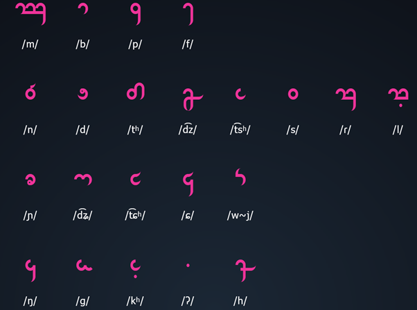
These are very similar to the consonants in terms of styling and negatives however there is a flaw which I would say is major: the vowel glyphs are all the same as the consonants. This is referenced on the website and addressed with a pretty good explanation: “The vowels use the same letters as five of the consonants. As consonants and vowels alternate in words, this creates no ambiguities in sequences of CV(Q) syllables.”.
This is a unique way of representing things that could only be done in a language with as restrictive a syllable structure, something Toaq only partially fulfils as the next sentence explains that it does create enough ambiguity to warrant double vowels being marked and marking the start of a vowel onset syllables. I think the point about unambiguous vowels is moot if a new system is needed to make it unambiguous. Once again this could be due to the problem of limitations to the style of individual letters, 5 vowels only adds 100 x 39/34 so 15% (reference number 2) more characters, or perhaps this choice may be made due to learnability but I would consider adequate vowel marking an absolute necessity when it causes bad reading.
Generally a good idea to emphasise diphthongs if there is no specific glyph for them, personally I would have a whole glyph dedicated to them but obviously keeping the number of symbols that need to be memorised low was a clear goal here so this was good design.
Special symbols
This is a nice looking symbol and makes names obvious.
This is good in terms of design as it creates blank space at the normal viewing height for characters while being long and spikey to create contrast. Unfortunately this is a 5 stroke symbol which is a lot for something that will be used fairly often, another shape which requires much less time and takes up slightly less space would be perfec tbut I think this glyph is almost okay.
This glyph is good as it creates vertical visual contrast rather than horizontal meaning it shows a break in the sentence but also doesn’t look anything like the subordination mark. I really like the look of this character as it reminds me of the ithkuil 3 script which I am very fond of.
I think the design of this was meant to reflect the fact that it’s somewhere in the middle of the interrogative and declarative which is clever however the contrast isn’t really seen from afar and there could be much more visually distinct characters which still form a middle point like this.
This is too similar to the declarative end.
Variable marks
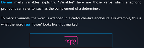
This is a very creative way of showing the grammar of Toaq and should be greatly appreciated. Unfortunately this often makes an unfilled space above a word, I’m sure there’s a clever way of making tone work with this system but as for now I believe it’s worth it.
Overall I believe this script deserves a lot of love for it’s wonderful style, usability online and integration with Toaq’s grammar. Derani has come a long way and still has a long way to go, so show it some love!
1 https://www.dyslexiefont.com/en/dyslexiafont/ all points except 2 and 5 reference this
2 21 consonant marks + 3 tone marks + a diphthong mark + a hiatus mark + the prefix mark + 5 grammar marks +2 variable marks
3 https://toaq.net/refgram/orthography/ Accessed on 26/07/2023
Old Poster for a Dr Stone translation project
I started this a while ago and only made one panel of manga and two panels worth of translation but it kept me occpied while I was sick and I really think that manga and memes and other media with a high content to word ratio is the best stuff to translate as you can have a much higher volume of stuff.