Reddit Activity 08 - 28 June [OC]
Reddit Activity 08 - 28 June [OC]
During the Reddit Blackout i made a graph showing the posts and comments/day (Link).
Some days ago i was asked to make an Update so here it is.
Source Data is from here and contains the same Data as some may know from here. Only difference is that the post and comment count is summed over the day.
EDIT:
The Original Post Data contained inconsistent Data points on each day (see here).
This is the corrected Chart, which uses the difference in Post IDs between the days to calculate the daily number (adjusted to s between the api calls):

I also adjusted the values to 10^6 and adjusted the y-axis ranges, I hope this makes it easier on the eyes.
For people complaining on the mixed chart: Double column looks bad with 2Y-Axis, and double lines looks too empty. 2Y-Axis are necessary cause of the difference in scaling of the posts and comments data, only other option would be an axis break.
Be interesting to see what happens between this period and over the next month. I made the switch today and I'm sure many more are doing also.
Welcome! :)
Same with me - just joined a few hours ago! It would be great to see a viable community-run alternative to Reddit and other online services.
Same yesterday, still adaptating to Kbin and the Fed network, but anyway it's already a breath of fresh air!
Yea i wonder if it does happen how much of a panic reddit is gonna be in, cos it cant reflect positively on their IPO. I hope they get screwed
Especially when 3rd party apps stop working.
Unfortunately we won't know statistically like this graph shows unless someone wants to pay the astronomical API feel to pull this data.
Welcome to the Fediverse coming from kbin.social!
Welcome to the Fediverse!
Too many of my favourite communities are still yet to make a switch, but I sure as hell hope they do! r/crowbro would make an excellent addition to lemmy.
Yup. Committing tonight; have to do it before the delete tools lose API access, ironically....I think. Not entirely sure how they work. Lol
Wow, I’m surprised that there wasn’t a bigger dip during the blackout. This shows how mainstream Reddit has become, and there’s a lot of momentum for people to stay there. But we don’t need to get hundreds of millions over to Fedi, just enough to have quality discussions. I’m more interested in seeing the continuation of the growth curves for Lemmy and others!
I'm curious to see what happens when the 3rd party apps shut down. Most people I know that use them are just waiting on them to shut down before they change their habits.
Also, it's not going to change overnight. I suspect the quality of Lemmy/Kbin will keep rising while the quality of Reddit keeps declining. This will gradually shift where people go for their link aggregations.
Yup, still been browsing reddit but when rif is off I'll be off too
When people rage-quit Twitter, it was like 2M - they absolutely flooded Mastodon, but it's not really significant to Twitter. Reddit also lost 1-2M of a similar user base: absolutely flooded Lemmy & kbin; minimal effect on Reddit.
API access seems like it will be a much bigger deal - not only the people that use 3rd party apps, but the propaganda & spam bots as well.
Yeah I don't need Lemmy to go mainstream it's already plenty for me the way it is.
It’s a good though. Reddit doesn’t need to fail for Lemmy to succeed.
I just updated the post since it was missing data from 8-9 June. With this the dip seems a bit lower, but we can't know for sure since there is no more historic data reaching further back to my knowledge
Though, I do kinda like the way it is rn. I mean, I hope for more communities & content someday. But, the vibe here is so calm & courteous atm. Like the best & kindest ppl are here now.
Idk.. I like all you guys, ig. Lol. It's just nice rn 😌
Agreed! Everyone is chill here, it’s not just a bunch of karma whores, bots, and assholes dominating everything.
It's so chill. The askKbin threads are full of such honest answers at the moment, not something trying to always be a joke or make a pun.
Exactly, I miss some of the smaller communities here but I don't miss having subreddits with hundreds of thousands of people. Besides, reddit is only going to get worse, if the fediverse continues to get better eventually people will move over. It's a marathon, not a sprint.
A vast majority of my posts on Reddit about their decision to remove 3rdPA was met with a "who cares?!"-type of response.
Me too, barely any of my subscribed subs stayed open during those first few days, effectively making reddit unusable to me, and I refused to /all or /frontpage so I could have expected a much shaper drop
Probably worth considering that the (admittedly subjective and difficult to measure) quality of those posts and comments has likely taken a big dive.
It's purely subjective but I've seen a noticeable increase in bot prevalence. My lurker account has recently had multiple porn bots suddenly start to follow it which has never happened before.
What I wouldn't give to have stats on what % of the active Reddit community is actually organic vs bot.
The Twitter parallels continue.
I wonder if Reddit is setting thousands of bots loose to keep the activity high so their IPO looks better or something? I don't know how any of this works but something like that wouldn't surprise me.
Look on Wednesday, comments are posts are almost identical. Highly suspecting huge increases in bot activity after Sunday.
Hi, I'm the creator of the blackout tracker. I have a question, which I'm too lazy to verify myself. To get the total number of posts/comments per day, did you sum up all the data points
perMinutevalues over the day or did you take the difference between the first and last ID of the day? If you went for the first option, did you account for the time between each post? Because the time between each data point can vary, since I stopped and restarted the server multiple times, during which no data was collected. Also if you look at the time frame on blackout.photon-reddit.com the peaks and lows over the 2 days visually looks a lot lower than in your graph.Hi, thanks for your work and good point.
It is as you said, I am just summing the data since I don't know the Post and Comment Id format and how to convert it into a number. Is it Base64?
Here an Overview over your coverage though:
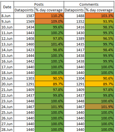
I guess this explains the higher number on the 8-9th. There seems to be a timeframe with 30 second pull intervalls on these days
Almost, it's base 36. I'm using these functions for converting them. The ID is incremented for each new post/comment. So the difference between the last and first post ID of a day, is the total number of posts on that day. In that coverage you can see pretty well the 2 days where my internet was struggling and when I switched to cloud hosting.
Nice to know that the posts per day are staying lower than they were. Fuck em
Pretty sad, but whatever. I’m super happy with my new home here.
Seems like reddit got more popular over media covering it?
I'd wager it's bots.
Oh I'm sorry, I didn't realize the 8-9th june was missing. With this it shows a decline from before, but it is difficult to know how big the effect was without more historic data. Sadly we don't have more than that.
I updated my post if you want to check it out
Going through your source you are hitting
commentsPerMinute.json for comment counts
As part of your reddit api pull, what reason do you believe this information is accurate and not falsified?
It would be very easy to do so.Replying through my kbin since i can't reply to kbin from lemmy.world right now for a reason:
It's not actually my reddit api pull. As far as I understand the code, in a regular time intervall the newest post and comment are pulled to obtain the per minute data.
Not sure if that info is directly obtained from the reddit api, or if they use a comment/post ID to calculate the difference between each sampling point. Am not that good at coding myself.But yeah i think that reddit could manipulate that data without issues.
There are some paying traffic monitoring sites that apparently showed a dip of 20% too (Reported here). They also report that the average time spent and session counts went down by 14% and 8%. Since this data is not obtained from reddit directly I think it might be a bit more representative
Anyone notice that comments and posts are almost at the same level on Wednesday? Very suspicious, I think spez has really been pumping up bot activity just to give the appearance of not bleeding users.
Unfortunately this is barely in the realm of statistically significant. We'll have to see how things sit after July 1st.
So basically, u/Spez was right and people really are addicts. Shame, but not entirely unexpected.
I am sadly missing data reaching further back for any real comparison. It seems that Monday and Tuesday always has the highest activity, so the Blackout Effect should actually be compared to those timepoints the week before. Comparing the Thursdays for example, you still see that we haven't reached the same activity as the week before the blackout.
But all this is just assumptions without several historic data points of the weeks before the Blackout.
I do think a huge amount of content is bot generated on the site though and I wouldn't be surprised if spez also used ghost accounts to generate content like they admitted doing when reddit was created. Website tracker sites already said they saw a big decline in amounts and duration of user interactions of the site. Also the different protest forms did have some advertisements getting paused which is a big deal for the site. Will be interesting to see how the site value change will develop in the coming weeks and if user activity will stabilise back to normal levels or not
I'm no data visualisation expert, but wouldn't it be better to have 2 lines rather than a line and a bar? To me this kinda seems theres a direct relation, which i guess there is but still...?
I just populated the new data into the sheet that I used for my previous sheet, on a request for an update on the data.
I would have used a double column chart back than but it looked bad with double y-axis. Double lines is also less visually pleasing here in my opinion (too much empty space). I also depicted the data values in the columns in the old chart since it had less day points so the columns were wider and the values still readable.
Thats why I mixed both chart types.
I agree that bar chart with double y axis looks bad, ive always been confused whether the bars are in addition or separate, e.g. blue ontop of orange, blue = orange + blue, or blue just = blue, i only recently realised it was the latter, it can be harder to read aswell since it doesnt start from the bottom. Also i get what you mean about the double lines with empty space, tho personally it doesnt bother me in the slightest
It would appear that the protest wasn't much more than a flash in the pan.
However, I do hope that the people who found other channels won't neglect them and favour the Fediverse...
I certainly will not return to regular use of Reddit (though I'm sure that, for now, searches will still bring many relevant results available only there - I'll open them anonymously).
Oof, this plot pains me. Commas on the axis labels would have been nice, but more importantly there's an obvious daily seasonality trend across the course of a week, and I don't think the % dips shown account for that. Had the blackout not occurred, at least some of that dip would have happened naturally.
Sadly no way of getting that data, since the data logging from the source only started on the 7th.
As for the commas, yeah i guess I should have made the values as 10^6.
Maybe if I make a follow up post at the start of July if the Raw Data gets updated on the sourceBtw am replying from my kbin account since there seems to be an issue between lemmy.world and kbin right now. My comments just won't go through to kbin users
Right? If anything it's a little depressing - I don't see much change.
A better metric to check is the average amount of time spent by users on the website.
yeah some sites already do that but they don't release the information without paying
https://techcrunch.com/2023/06/28/reddit-protest-user-engagements-site-activity-impact/The site they used for their data is https://www.similarweb.com/
I just started these charts in the beginning since i was interested in the number per day instead of the number per minute that is reported in the original source.
Though my data seems to also be incomplete cause of missing data points.
https://lemmy.world/comment/636721Having some trouble replying between kbin and lemmy.world right now so I am using my kbin instead
That's completely fair. I have looked into similarweb before, their subscription rate is pretty steep.