Wealth shown to scale.
Wealth shown to scale.
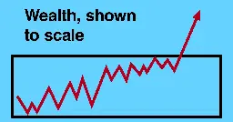
mkorostoff.github.io Wealth, shown to scale
Wealth inequality in the United States is out of control. Here we visualize the issue in a unique way.
Credit to @[email protected] for posting in a comment section of another community.
A visual scrolling graph demonstrating wealth in america.
This graph can acts as a great example, easily deployable and any sensible person will see the absolute ludicrously that is often misunderstood. I hope anyone out in the field can find utility in this.
Solidarity.