Fountain Pens
-
New Pen Day! Asvine V200 Titanium
My new Asvine V200 Titanium with a medium nib arrived yesterday. The vacuum filler is much smoother than any of my V126s, and on par with my TWSBI Vac 700R. I also picked up a 30 ml bottle of Diamine Earl Grey, but the number of fills I'll be able to get with this pen is limited by the section being too wide to fit in the mouth of the bottle. I need to get different ink? Oh no!
Calculator is a TI-nspire CX CAS, and was my first calculator with a built-in CAS.
-
My most used pen - Hongdian 1851 Forest Purple EF
My wife got me this Hongdian 1851 for Christmas last year, along with the astronaut pen holder. Since I keep it out on my desk, it is the pen that I reach for most often. It has the finest line of all of my pens and I keep it inked up with iroshizuku murasaki-shikibu, which is an incredibly close match to the body of the pen. It has a lot of feedback without being scratchy, and is great to write with.
The calculator is a Casio fx-260 Solar II, which Kristi also got me for Christmas some years ago. It's the calculator that I grab most often since it is the easiest to get to. It's my little Apocalypse Calculator since it has no battery and is solar powered only.
-
My new Lamy 2000!
I've really been liking this pen. It's a medium nib and I could not be happier with it's performance.
-
Mod not active
Hi,
I noticed that the sole mod of this community seems to be an inactive account.
Although this community is very civilised, I wonder if a) there should be another mod from an active account, or b) we have the power to add a mod.
-
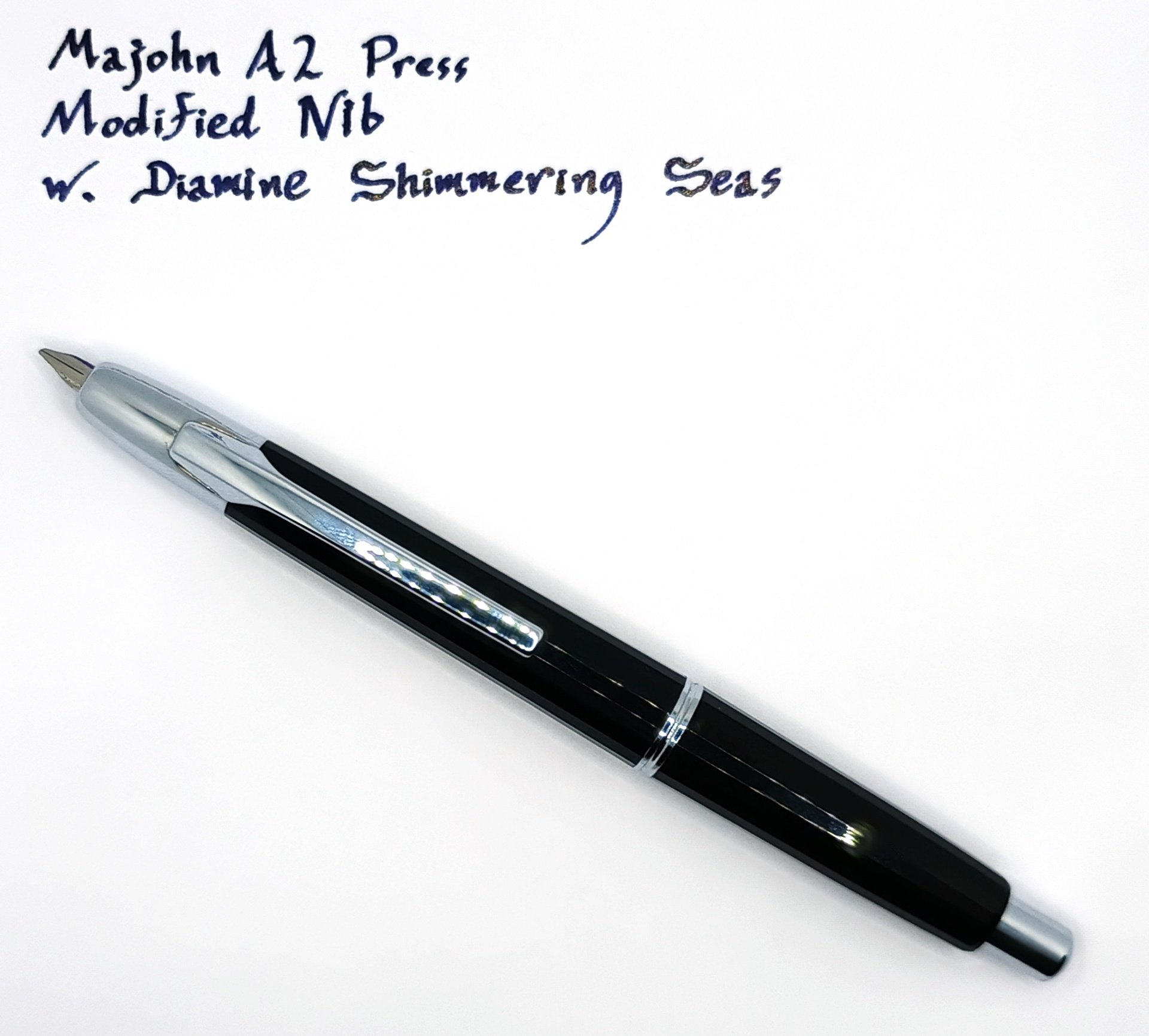
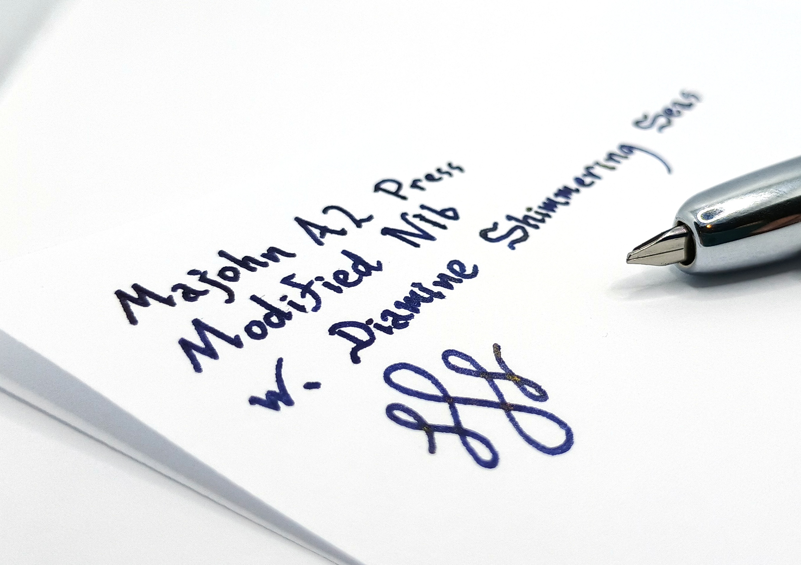
Po'tD: Majohn A2 Press With... A Modified Nib
Salutations, squawkers and waddlers. I haven't done one of these in a while.
The reason for that is, well, boring old pragmatism. I like fountain pens, and I have a handful of them, but due to the majority of my work being digital by nature one way or the other I don't write a whole heck of a lot down on a daily basis anymore. I do a little, and because of it having a pen around is still essential. Obviously I prefer to use a fountain pen. But I don't write enough when all is said and done to justify having more than one fountain pen inked up at a time. I know how some of you do, but an ink fill for me can easily last a couple of months. If I kept multiple pens inked up I'd never get anything done in between all the time I'd spend unclogging and cleaning them out.
Therefore my pen rotation schedule is pretty slow. Lately I've been using this:
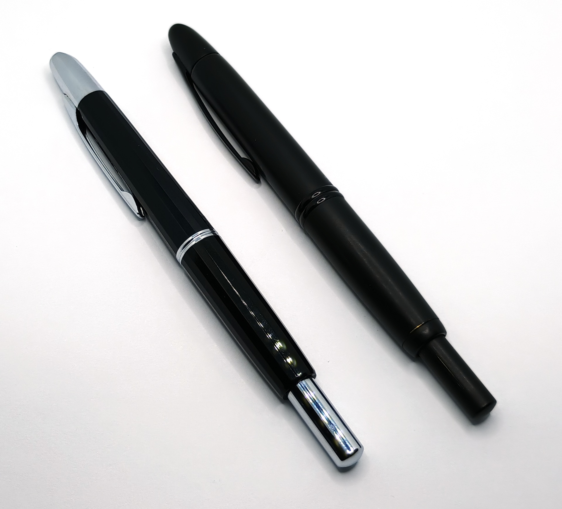
This is a Majohn A2 Press, and yes, it's that pen. You know the one.
The A2 is, let's call it... inspired by the Pilot Vanishing point to a significant degree. So much so that parts between the two are actually interchangeable.
The A2's a damn sight cheaper, though, and has several construction differences starting with a plastic body (in this variant, anyway; they make a metal one now) with a faceted look. The facets do in my opinion give it a very subtle Art Deco/1920's sort of vibe but it's understated, not totally in your face like so many things are these days that are trying hard to evoke whatever bygone era.
The A2 is, of course, retractable. No cap. You press the long plunger on the end like a regular ballpoint clicker pen and the point retracts into the body, with a little trap door closing behind it to keep it from drying out. Because of this the A2 is just as long "posted" as it is put away, minus the length of the point itself. That's about 5-1/2" in total when retracted. You can neither make it any shorter nor any longer.
The A2 is a fairly fat pen by the standards of my preference, but it's not as fat as any of the turned wood or trendy brass models I seem to see on display these days. The thickest point is at the silver band in the midsection where it unscrews, and it measures 12.33mm or 0.485" at that point. So strangely enough, that means it is a few thou thinner than an OG Vanishing Point, which is: 13.38mm or 0.526". It's slight, but enough to be noticeable.
I prefer a slim pen, and preferably one with a straight body, and the A2 is neither. The whole thing is tapered down at both ends like a very emaciated football. This carries on all the way down to where you grip it to write, which I found a trifle disconcerting at first (and the Vanishing Point is exactly the same way). You get used to it. Right along with getting used to the pocket clip being on the "wrong" end of the pen, up by the point rather than at the tail, and totally immobile. This is presumably a hedge against leakage since the pen'll always be pocketed with the tip up in this configuration.
The elephant in the room? What elephant? Oh, yeah. That elephant.
Apropos of nothing, you can get an entire replacement mechanical assembly for the A2 for about $19 online. The point and nib assembly, metal cap for behind the cartridge, a little cleaner bulb, a spare converter, the works. This enables the possibility of committing violence to your A2's nib that you would never in a million years consider inflicting on your Vanishing Point, and clicking undo on that if you fuck it up will cost you less than a single Jackson.
The problem, you see, is that the Majohn is one of those newfangled Asian pens whose maker assumes the sum total of your desire in life is to have the thinnest and sharpest needle point on your fountain pen in the history of the universe, and to hell with all other considerations. The A2 comes in "fine," which is extraordinarily fine, and "extra fine," which is so sharp as to be practically useless. At least by my standards. I understand this sort of thing is very popular in hemispheres where people write tiny in pictoglyphs and need to cram them into little boxes on forms, or something. But that's not what I do. I prefer an italic or, even better, an oblique nib. There's no sense in being anachronistic if when you hand someone a written page they can't immediately tell. Where's the fun in that?
So I took a whetsone and I hacked a spare A2 nib assembly into the widest oblique point I could manage before I started to destroy the plastic feed and nib support. The net result is 1.3mm and, well, I prefer even a little wider. But it'll do.
Mine is therefore probably the only A2 Press in the world that'll put down this.
My A2 is now a pretty wet writer (evidenced by the feathering on the cheap copy paper I just doodled that on) but kicks out a line approximately a zillion times bolder than it did when it was stock. The stainless steel nib the A2 comes with is pretty thick vertically at the root, which I had to cut into to accomplish this. So there isn't a ton of line width variation between horizontal and vertical strokes, but there is some and I'll take what I can get.
I currently have it loaded with some Diamine Shimmering Seas, which is one of their "shimmer" inks that's supposed to present a metallic sheen. It works best in a broad pointed pen, so it does pretty okay out of this one. The effect is pretty tough to photograph.
The above comparison is inescapable every time the topic comes up. Yes, I do own a genuine Pilot Vanishing Point and no, I generally don't leave the house with it. The Pilot has a lacquered brass body and is significantly heavier than the Majohn, has a nice soft and refined click, and generally feels more premium overall. As you'd bloody well expect it to, for what it costs. It's a very fine pen (both in terms of construction and line width) and while Pilot does make a "stub" nib for it, the widest and only size you can get is a poxy 1.0mm, and a replacement unit is north of $100. That is, just for the nib assembly.
So for daily use I'll stick to my hacked up clone, thanks.
-
Travelers Company Brass
A tiny brass pocket pen.
Push cap, takes international short cartridges. Patinas with age. This one is about a month old.
P.S. Post a pen from your collection! Let's get this community going!
-
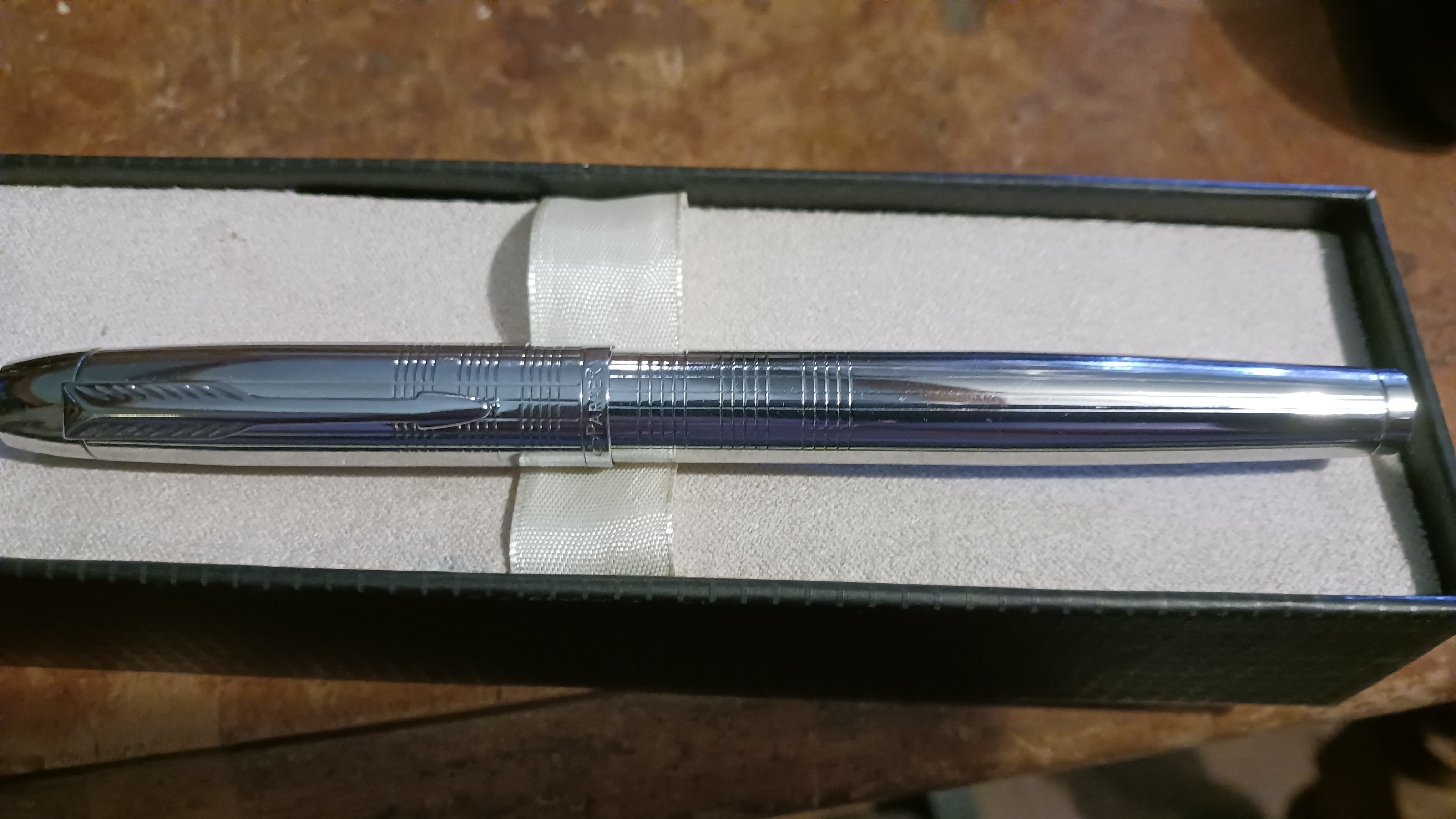
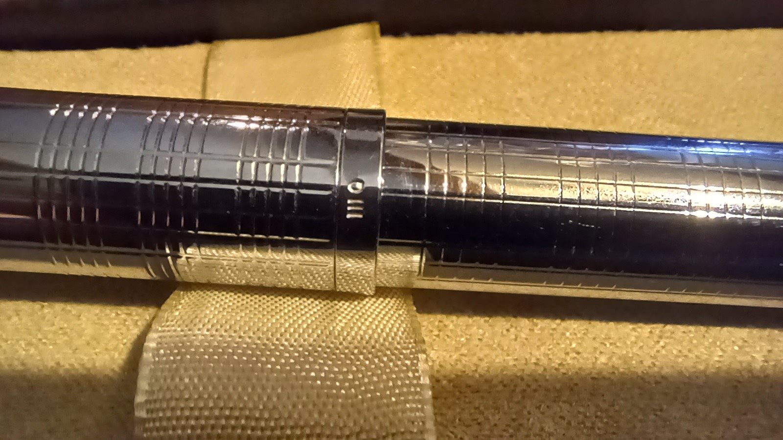
Hongdian M2
Was quite impressed with this pocket pen.
All metal body, good clip, smooth steel nib, converter included. All for about £15.
1 and a quarter turn twist cap.
Farting cat finial.
Arguably competing with Kaweco AL sport IMHO.
-
All six Asvine V126 colorways!
I finally completed my collection of all six colorways of the Asvine V126 fountain pen. All of them have Asvine medium nibs, and I've been delighted with how well all of them feel in the hand and lay down ink. I'm also mighty happy with the inks that I've paired them with, although the shimmer in the Heart of Gold means that I need to spend more time on maintenance than the others.
-
This scratching is not normal on a new pen right?
Brand new Pelikan Twist came with multiple scratches at the top of the barrel. One on each side. All about the same length as the one in the photo except for one that goes under the sticker (not counting the mould line on that side).
Kinda feels a bit 1st world problems but I'm poor and this is the only Pelikan I will ever (short of winning lotto and getting incredibly lucky) get to own and feels disappointing to get a brand new pen that's already scratched.
-
Preppy cartridge too short?
Is the cartridge coming with Preppy really too short to reach the back of the barrel? Never seen that in a fountain pen and looks unnecessarily risky design. I am wondering if the vendor sent me the wrong cartridge.
-
Makes and nibs?
I am about to buy a Platinum Plaisir, Lamy Al-Star, or a TWISBI Eco (or possibly all of them) but I can't decide which nibs. Even physical shops around here don't have inked pens to try. Problem is different makers and countries describe nibs differently, eg with Japanese F often being like European EF apparently.
Any tips? I hate scratchiness and like some stroke variation, but I generally prefer finer nibs usually on cheap paper. If that means anything, my Muji pen is about right but a liitle too scratchy. My old Pilot F is excellent.
-
Paper suggestions
Hello folks!
I'm still rather in the "shallows" as of yet, I have a handful of pens (Lamy, Platinum Preppy, Donegal Pens) and only a couple of bottles of ink (I rather like Noodler's 54th Mass.). One of the areas in the hobby that I'm least knowledgeable in is paper. So, I'm hoping that you folks have some recommendations, both for myself and my sibling who is a bit of a fountain pen enthusiast but has sensory sensitivities.
What are you favorite papers, both loose leaf and bound, for texture, color, and any other properties? Preferably, nothing too bright/with fluorescent pigment.
Bonus question: I really like muted colors (desaturated in digital-speak but I think that doesn't write mean the same with inks). Any suggestions for good inks on that category?
-
New Ink Day: Sailor Shikiori Sansui – Yutsubame
Sailor Shikiori Sansui – Yutsubame
Has a reddish coral shade. The great thing for me about this ink is that shading is visible using the fine nib, and if lucky, there's also shading using extra fine nib.
I'm new to the fountain pen hobby and I fell in love with shading inks. My goal probably while doing this is finding shading in for Fine and Extra Fine nibs (my handwriting gets uglier with wider nibs).
-
Kakimori brass nib horrible writing
I hope somebody can help. I received my Kakimori brass nib today and the experience is horrible. It wrote okayish for about 10 lines but stopped since then. The only way to make the ink flow is to keep it more then 45 degrees angled or pretty much flat.
I cleaned it with a toothbrush multiple times and dipped it in ink a lot. I colored two A5 pages to get the ink going but it didn't help.
Do you guys know something I can do to make this nib work normally? I assume it should be able to write in an angle the same as regular pens?
-
Switched ink recently.
My Pelikan 4001 Blau Schwarz bottle ran out so I bought a bottle of Parker Quink Blue Black. I don't think I like it as much, it feathers and bleeds much more and the colour is not as dark. It's not a bad ink but I've got 57ml of it to go haha. The Pelikan ink is just terrific in my opinion. It is very well behaved and shades beautifully from light blue in the lines to a deep dark blue in the shades. It even smells like some kind of inky soy sauce. As you can tell I'm slightly in love with it so I'll miss it.
-
My current collection
From left to right:
- TWSBI Diamond Mini Classic 1.1mm stub nib
- Pelikan 140 M(?) nib
- Unknown Kondor pen
- Lamy CP1 F nib
- Lamy joy 1.5mm stub nib
The TWSBI is the only pen in this collection that I actually bought. The rest came into my possession through family and as such are mostly older pens.
The Pelikan 140 is by far the oldest and my current favorite alongside the TWSBI. From what I've been able to find, this one was manufactured somewhere between 1955-1963. It is also the only pen in my collection with an actual gold nib.
The Kondor, just like the TWSBI and Pelikan is a piston filler and has a in my opinion strangely shaped nib. It is slightly scratchy unfortunately.
The Lamy CP1 is the pen that I used the longest out of all of these and was my daily driver during my later school years. Back then I had an M nib on it which I later switched for an F. Despite it being a beatufil sleek pen, I rarely use it anymore since the grip section tends to accumulate some ink near the front. This combined with my very close grib means that I always get ink on my fingers when writing with it. I am not sure if this is a defect of my specific pen or is something that has been fixed in newer models as this pen is apparently also quite old, based on the "Made in W. Germany" inscription under the clip. This pen also tends to be kind of unwieldy when used with the cap posted, as the cap is made of a much heavier metal than the rest of the pen, making it unbalanced.
The Lamy joy is a pen I briefly tried but found to have a much too thick nib for my daily use. Compared to the TWSBI it is also kind of scratchy.
-
Fixed TWSBI Go ink problems
I brought a TWSBI Go with a fine nib a while ago.
From day two it had issues with the feed drying up extremely quickly when using Diamine Scribble Purple ink.
It dried out slightly slower when using Lamy black ink but for some reason it would fling out drops of ink when uncapped or jostled (so much fun finding random ink blobs on your dark mouse mat).
Tried flushing the pen with water, taking the nib out and cleaning it with soapy water to no effect.
I was about to return the pen but I found a random post that suggested flushing the entire pen with soapy water and cleaning the nibs slit would fix the issue.
Seeing as I had nothing to loose and doing so wouldn't damage the pen I gave it a try. I ended up using some cotton sewing thread to clean the slit as that was all I had to hand.
After cleaning the pen with soapy and clean water, cleaning the nib, drying, reassembling and reinking I gave it another go.
And to my surprise it writes like a dream now and has no random ink going flying.
While I know how I went about fixing the pen wasn't the best method I thought I would post about it anyway.
-
You can use fountain pens for AP Exams
Hey everybody! I am not sure if this is super helpful to anyone but I just wanted to share that you can use a fountain pens for the essay section of the AP Literature exam. I just finished with it and I used my Lamy 2000 M nib with Lamy Black ink. I experienced limited feathering, no bleed through, and limited ghosting. Overall, it worked pretty well and I would recommend it if any else wants to try it.
Edit: I received my score so I can confirm that fountain pen ink shows up on the scantron
-
And so starts an addiction…
First fountain pen of my life. Parker Vector with "Medium" nib. I've already had it for two weeks, and although this was only meant to try out fountain pens, I think I'll keep it, since the nib is a great compromise between being smooth while not being fussy with office paper. Already chewed through a cartridge. Only bad thing with the pen is that the grip is a little meh – my fingers don't really like it.
My next will probably be a Lamy (mostly Safari). Any recommendations for the nib size so it fits my criteria?
-
You are all enablers!
So a while ago I thought that I would get a Lamy fountain pen to see if it would help with my handwriting.
So off I go looking around at what is available and find the Lamy Safari, then I find the Lamy Al-star which cost a bit more than the Safari and I prefer metal pens due to my gorilla sized hands.
So I buy the Lamy Al-star with a fine nib, some Lamy blue black cartridges and a converter.
Wasn't really happy with the blue black ink (wasn't dark enough) so I went looking and found the Diamine blue black ink which is my new fave.
Got a small bottle of that plus a bottle & cartridges of Lamy black ink and a EF nib for the Al-star.
Time goes on and I see people talking about the TWSBI ECO and the Platinum Preppy pens.
So after some debate I visit my local fine pen and stationary shop (kind of dangerous to my wallet) I am now the owner of a TWSBI ECO with an EF nib, a PP with EF nib, Platinum Pigment Carbon Black Cartridges & a A5 Rhodia Webnotebook.
All was good for a while then I had a need for a better pen to carry in my bag.
So today I purchased an Kaweco AL Sport with EF nib, another Platinum Preppy with a fine nib, a box of Kaweco perl black cartridges and a box of Diamine blue black cartridges.
Hopefully I have enough pens for now but something tells me that I don't.
-
Made this pen chest a few years back.
White oak, walnut, and Baltic birch ply. 3d printed pen dividers. It’s heavy and pen dividers are slick, so it doesn’t travel, but it’s held up really well.
-
Your worst reactions?
Manufacturers always say never to mix inks unless they're selling you a range of mixable inks, yet I have never had a problem when refilling pens that weren't 100% clean. What are the worst reactions you ever got from mixing inks on purpose or by accident?
-
Favorite blackest black ink?
I own a rainbow of beautiful colors, mostly from Diamine, but what I really miss a a truly black ink for formal days. I have a big bottle of Parker Quink Black, but I almost never use it as it's actually a middle-to-dark-gray ink even with my flowiest pens.
So what are your favorite, deeply saturated black inks?
Bonus points if it's (very) affordable and easily available in Europe (so no noodlers).
-
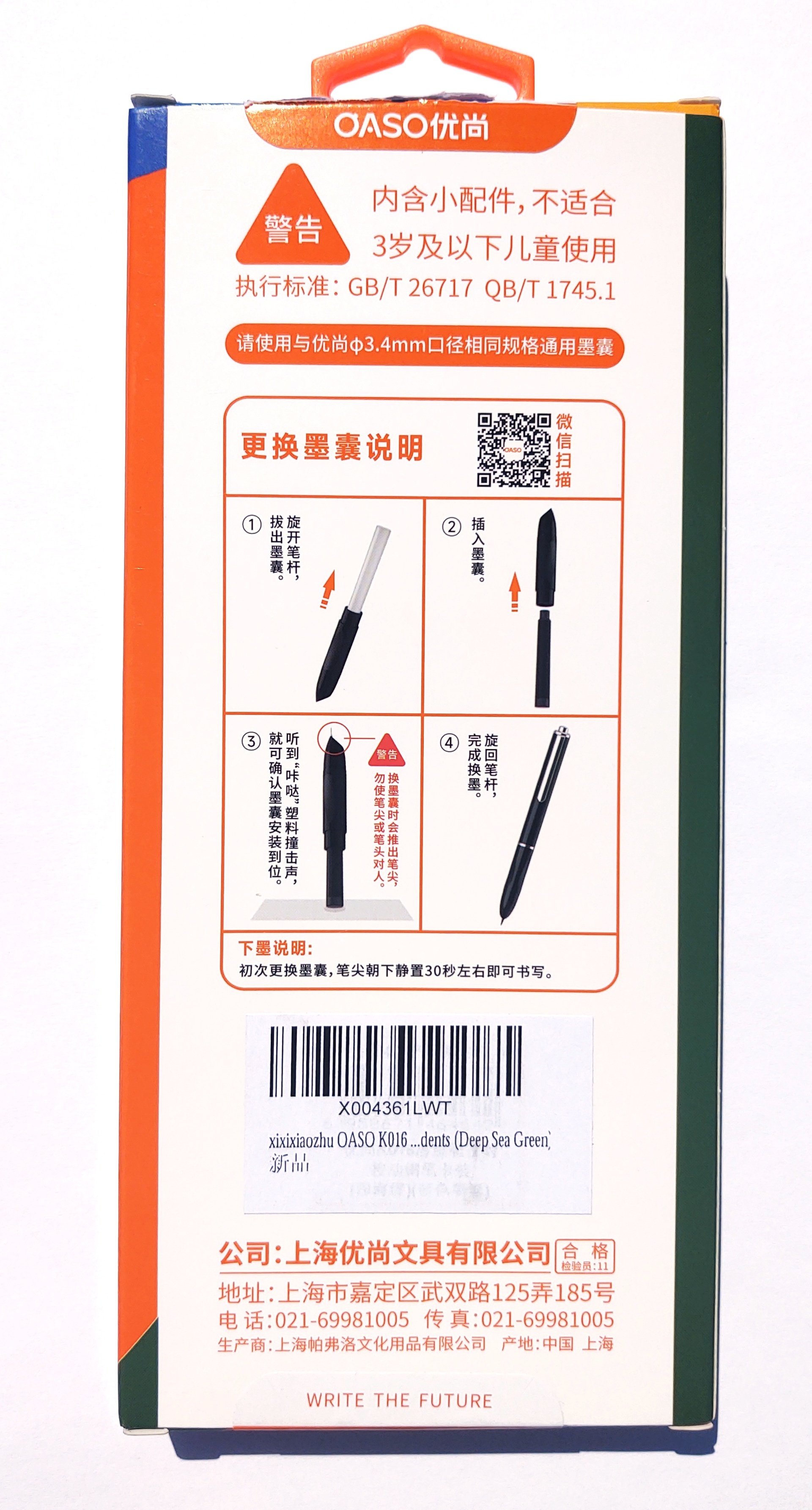
Oaso K016
'Nother Pen DisorderNew Pen Day!
Look, I have a bit of a... thing... for pens with two specific attributes. Italic or oblique nibs, and retractable fountain pens. I haven't seen anyone make a combination of the two, but.
Here's a retractable that is, at least, very cheap. Which is kind of unique in its field, because I'll bet you most of the other options you can name are pretty expensive. The most budget friendly I know of so far is the Majohn A2 Press, which will still run you $30. More if you want one of the nicer variants.
This, however, is the Oaso K016 and it'll run you less than ten bucks. I only learned about it recently. Maybe this is old hat to some of you. But I'm going to talk about it a lot now, because that's what I do. Look, just count your lucky stars that I don't crank out 30 minute long youtube video essays instead, okay?
It is cheap and very cheerful, and aimed squarely at schoolchildren. It comes in a variety of plasticky colors, but I had to get the "Deep Sea Green" because green is, clearly, the superior color for most things. The grip section is kind of a dusty forest green but I'd call the body section more of a seafoam sort of color.
This pen comes in the below pictured rather garish packaging, which is labeled almost entirely in Chinese. Which makes sense, considering this pen is apparently manufactured (per the box) by "Shanghai Youshang Stationery Co., Ltd."
This is made to appeal to the Asian market, and if all that didn't tip you off the kawaii mascot certainly should. The box, by the way, says:
- OASO Youshang
- Seal Press Pen
- K016 Push-Type Tip Extraction (i.e. it is a clicker pen)
- Budget Friendly
- Writes Smoothly
- Upright Pen Grip
- Universal Ink Cartridge
- Sealed Pen Tip - Thermally Insulted (i.e. won't dry out) and Corrosion Resistant (i.e. stainless nib)
- Inlet and Outlet Sealing Valve
And at the bottom:
- Youshang Submarine Cabin (your guess is as good as mine)
I'm paraphrasing some of these. The rear:
- 0-3 Sad Onions (Actually, it says, "Warning: Contains small parts, not suitable for children 3 years or younger.)
- Please use universal ink cartridges with the same specifications as the Youshang ones, with 3.4mm diameter
- Ink Cartridge Replacement Instructions
The rest is rather self-explanatory except:
- When installing (lit, "replacing") the ink cartridge for the first time, leave the pen tip down for about 30 seconds before writing.
The bottom lists the manufacturer's contact info, and claims that the product documentation and photography was done in Shanghai. No surprise there.
At the very bottom: "Write The Future." I thought we were supposed to fight the future?
Anyhoo. This is indeed a retractable fountain pen.
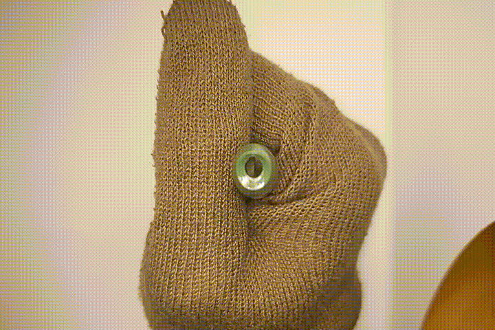
I said that already. It's a very basic model, all things considered, and pretty much every component except the nib and pocket clip are made out of plastic. One thing that jumps out at me about this which is different from all the other retractables that I own or have handled, is that it is not upside down. Or rather that it is upside down relative to all the rest of them. When clipped to something the point is downwards, as opposed to the Pilot Vanishing Point, A2 Press, Platinum Curidas, and Lamy Dialog which all clip with their points up. This is more like unto a ballpoint and the inverse of most fountain pens -- even non-retractable ones. But it does keep the clip out of your grip area for people who hate that sort of thing. Time will tell if this turns out to be a bad idea from an ink retention standpoint. Maybe don't carry this in the pocket of a really nice shirt.
The K016 unscrews as you'd expect, and the nib assembly remains captive in the grip section. I was a little surprised to find that in addition to the four blue cartridges the pen came with, it also had a fifth empty one already installed inside. So I dutifully filled this with some black Sheaffer Skrip ink I had lying around.
The grip section is slippery plastic, but has three flat sections giving it a somewhat triangular profile. You're not going to mistake it for premium, but at least it's not tapered down its entire length ready to squirt out of your grip like a watermelon seed. Like some pens I could mention. (Pilot, I'm looking at you.)
There must be some way to get the feed and nib out, but I'll be damned if I can figure out how. I haven't messed with it with too much gusto because I don't want to break it. Yet.
You install the cartridge the usual way via pressing it against the tube on the end of the feed. But that illustrates that the clicker mechanism is not in fact in the business end, because the whole thing squishes down against the spring when you do so. The K016 has a very stout spring in the nose and amount of force you have to apply gets progressively greater the further out the point goes, culminating in having to give it an alarmingly hard shove to get it fully deployed. That's a little strange. But it springs right back out -- whatever ratchet that toggles between the deployed and retracted position is on the other end, under the button.
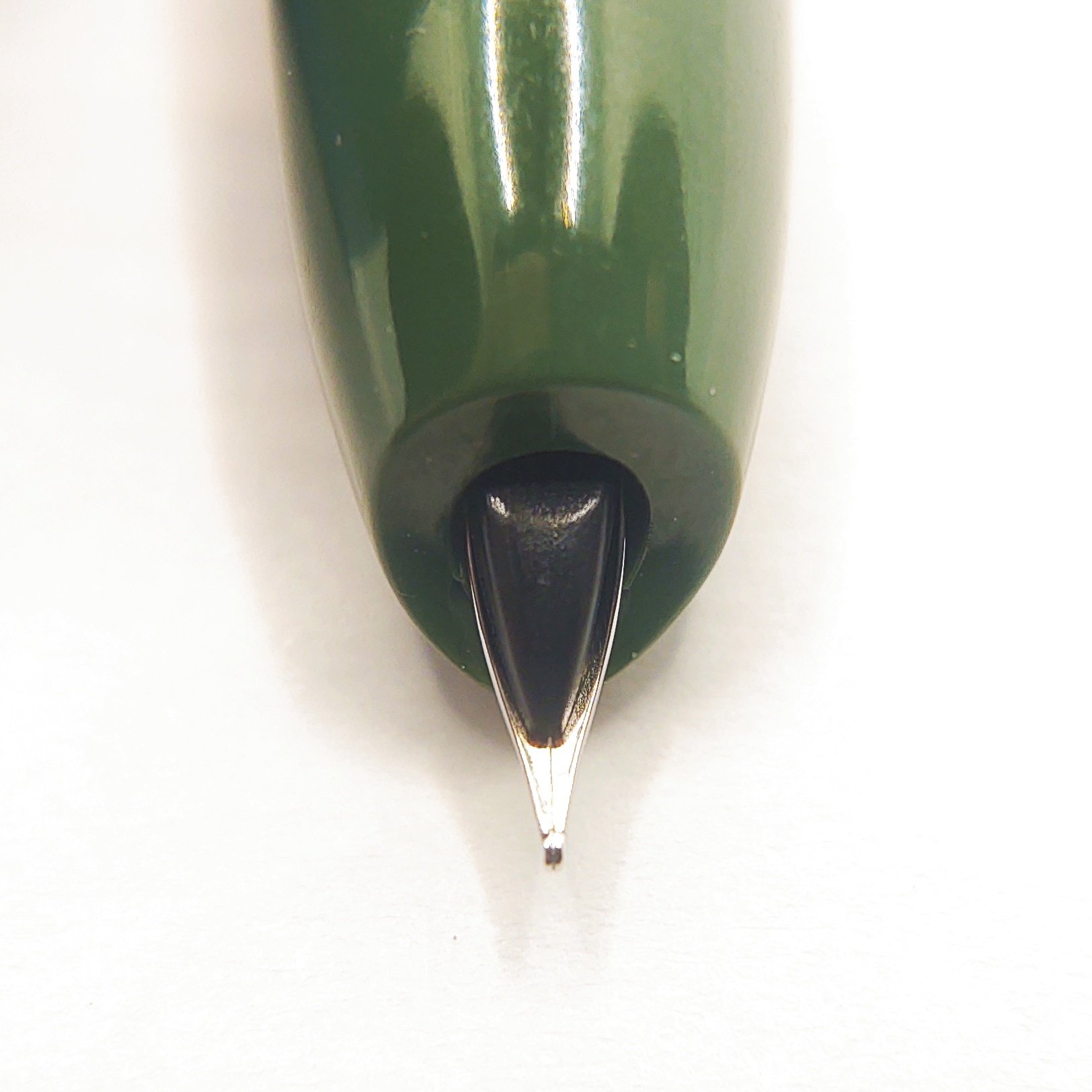
The exposed nib is very short, extremely stiff, and is supported for most of its length with the solid plastic feed:
The nib is a 0.5mm so you can quibble amongst yourselves if this counts as a "medium" or a "fine," but I will say as a habitual italic nib user that it's annoyingly fine by my standards. It is stainless steel, and while the online description claims that it is "iridium" I'm not entirely certain I believe this for two reasons. One is the writing feel, and two is that the package doesn't actually mention that anywhere.
Something about that 3.4mm diameter cartridge rung a tiny bell in my brain as well. That's because I measured one just like that while doing some home research on this thing the other day, vis-a-vis compatibility with the Zebra "V Refill" for the V-301. Well, those are the same as these. Totally interchangeable; this is indeed the same old China Standard cartridge that is currently flooding the East Asian markets.
The K016 has this in the end for sealing off when not in use. It's a little different from the usual mechanical trap door arrangement in the fancier retractables. Poking it with a paperclip reveals that it is in fact rubber. I suspect this accounts for the bodacious shove you have to give it to get the point out, since this'll surely add a whole bunch of friction to the equation.
It also introduces the possibility that over time the rubber could perish. So there's a fun thought.
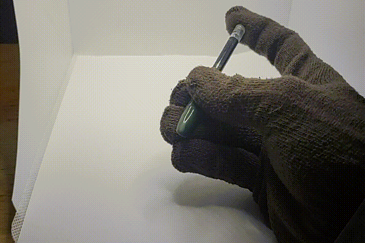
But I've spent all of these words without talking about the only thing that really matters in a pen. So, how does it write?
Well, it writes.
I'm damning with faint praise, I am. But you are definitely not going to mistake this for a premium pen. The nib is decidedly scratchy and catches frequently on ordinary paper, which made inking my doodle at the top of this a real chore. The point is very sharp and very stiff, leading to no expressiveness whatsoever. The ink flow seems to be much lower than average, such that the Sheaffer Skrip I'm using which is usually very prominently black comes out almost grey because it's spread so thinly.
This is not a pen that rewards variations in stroke, and it punishes writing quickly. You have to scribble pretty fast to get it to actually skip, but I did manage to do so (it's visible at the end of my scroll in the headline image) but the faster you write the thinner and less defined the lines get. This is a pen much more at home methodically plonking down katakana, not racing across the page in cursive.
Maybe it'll work better with the ink it came with. I'll try that later and see.
The point is also too fine for my liking but that's my problem. I don't do fiddly little glyphs as small as possible in neat boxes. I do big spiky seriffed letters, a lot of them, fast.
What's everyone's problem, though, is that it seems very sensitive to both rotation and angle against the paper, and getting either of these even the slightest bit outside of the very narrow zone that it likes makes the output even worse. Further, since so little of the nib's length sticks out, the bottom face of the grip section cruises really close to the paper at all times. I could see it would be definitely possible for a user with small hands to naturally hold the thing at an angle such that the plastic hits the paper, which is sure to cause some grief.
(What that sticker says, by the way, boils down to "Kindness Tip" and "Don't Point Your Pen At Anyone." Stab, do not the crab.)
But on the bright side, this pen is so cheap that you won't have to hire out a hitman if somebody steals or breaks it.
-
Wing Sung Lucky 300, 14k F nib “Flighter” style
Got this one when getting into the hobby a couple of decades ago. I think this might be my first gold nib, and one of only a couple left in my collection. Stainless steel styling and outer profile not too far off from a Parker 75, and the squeeze fill mechanism is actually a deeply seated converter very similar to Parker cartridges. But then, the clip is more Sheaffer, and that gold conical nib DEFINITELY is. It’s not quite the experience of the 1940s Sheaffer, but it’s quite nice in its own right.
-
Remember learning cursive with a fountain pen on this doubly lined paper when you were 6?
I don't know how your elementary school worked but we used to write on paper with a x-height line and a ascender line. As you can see I still need those lines lol. I wonder why these are not the standard lines you get on your lined paper. They are much better then the single big ones. The total line height is only slightly more than standard lines. If I had kept writing on this, maybe my handwriting might not have suffered as much.
-
My first “nice” pen… sort of… Waterman Phileas
So it’s only sort of nice, and this one is only my “first nice pen” in the sense that my first nice pen was another blue marbled Phileas in M. That pen walked off somewhere, and this one is the replacement. It’s still a nice writer, but the nib is just not quite as nice as the one it replaced.
That Private Reserve Naples Blue has been around since Y2K, I’m pretty sure, though hell, I coulda got it a couple years after that. I’m old now, the bygone years of shirking my studies blend together, LOL.
It’s still in good shape, no odor or mold that I can see, maybe a touch darker than I recalled, and still just as much of a pain in my butt to get out of a pen as it ever was. Had to flush the Waterman here four times just after dipping.
-
Vintage: Sheaffer Lifetime “Statesman” lever fill
This is almost certainly a late 1940s model, though maybe early 50s. The lever fills were phased out for all but black after the war. Re-sacced this one many years ago, IIRC with the polysac out of a Sheaffer converter, but I’m not inclined to crack it open to verify. Conical 14K triumph nib in a western F/M. Smooth with a hint of feedback, and no flex whatsoever. This was a thoroughly midrange offering, meant to be used daily. It slotted in between the Admiral and Craftsman below it, and several models and trims above it. The 1/4” gold fill band is the giveaway. The nib is STOUT, and the gold fill on the clip and band has held up beautifully.
They were not fucking around with these pens. Even this one retailed for around ten bucks in 1949, making it an $80-100 pen today, roughly equivalent to the cheapest solid gold nib pens from major makers today, funnily enough. Really though, general purchasing power inflation is a weird analogue in this product category, which changed so drastically in the 60s and 70s.
-
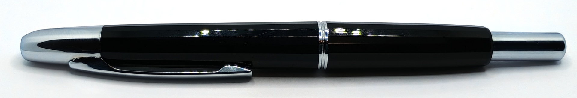
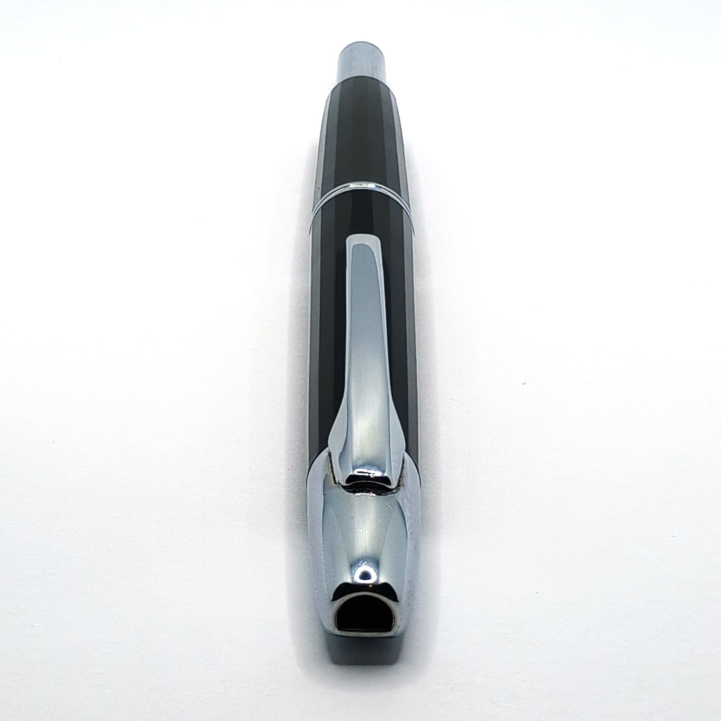
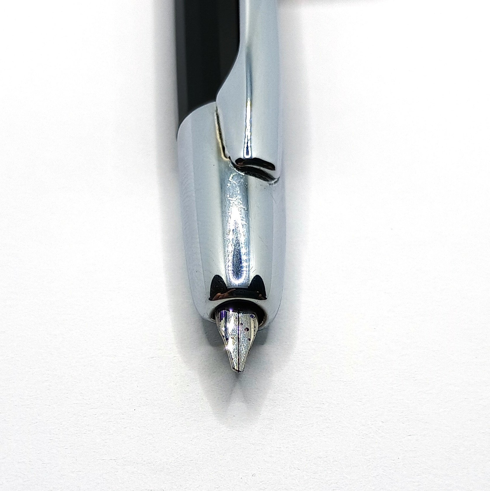
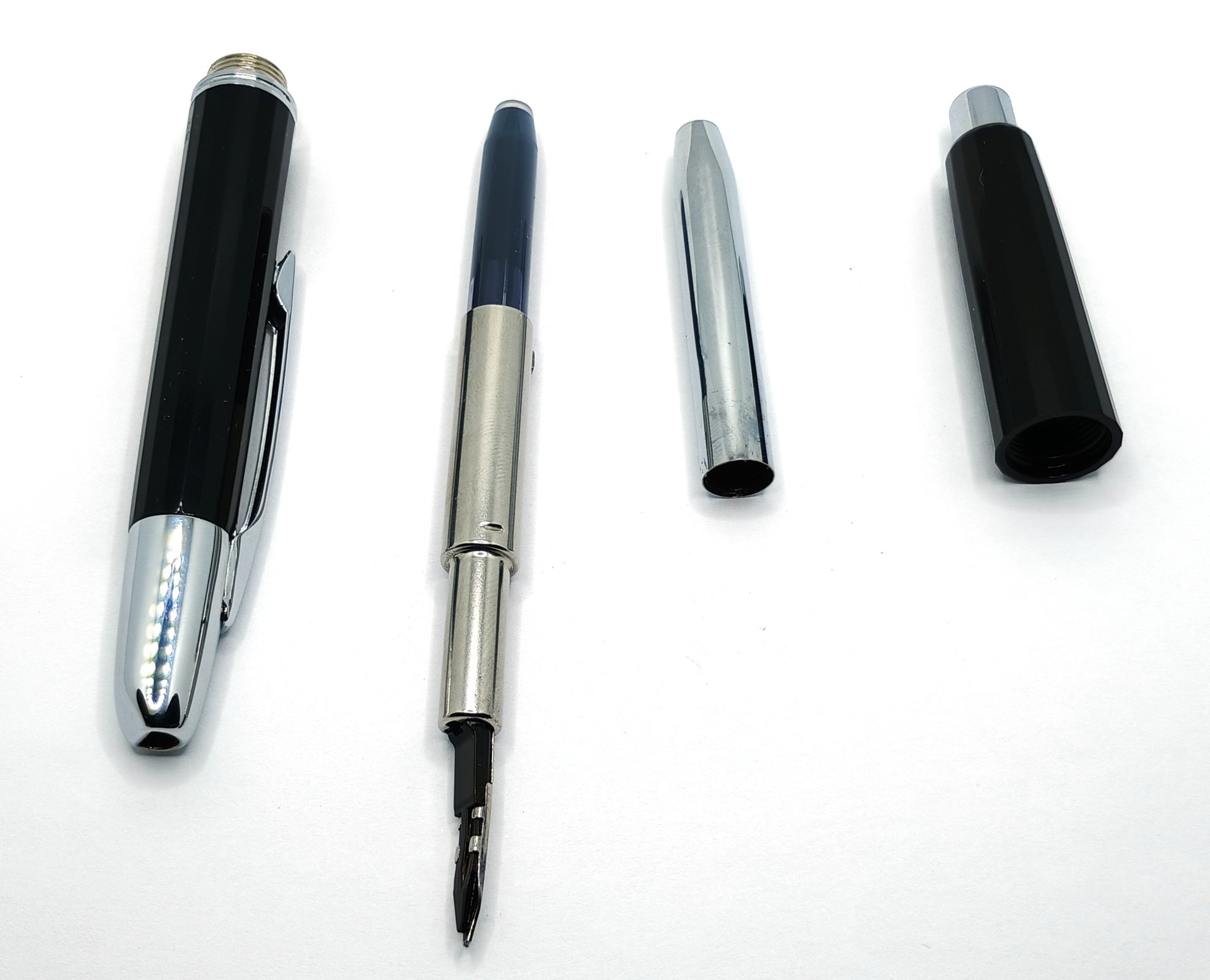
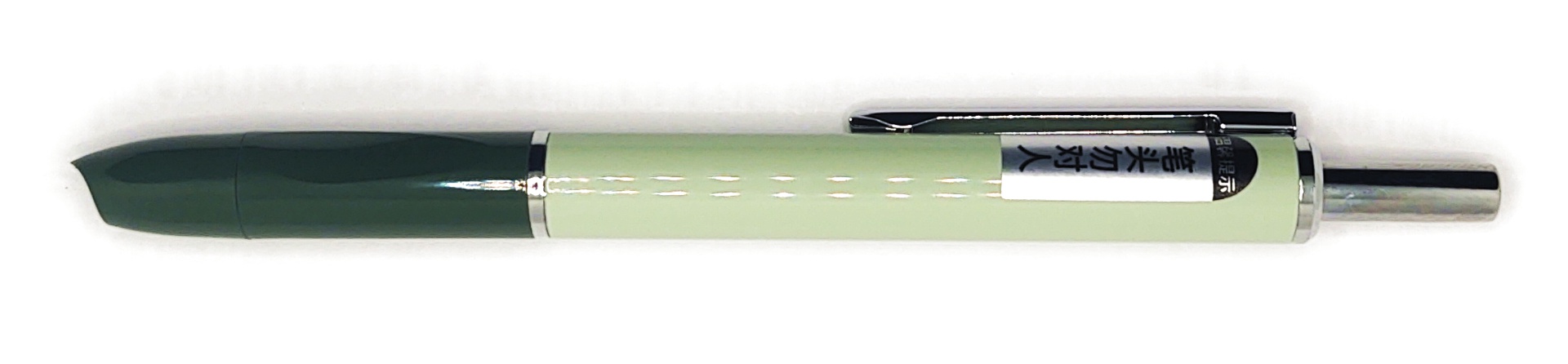
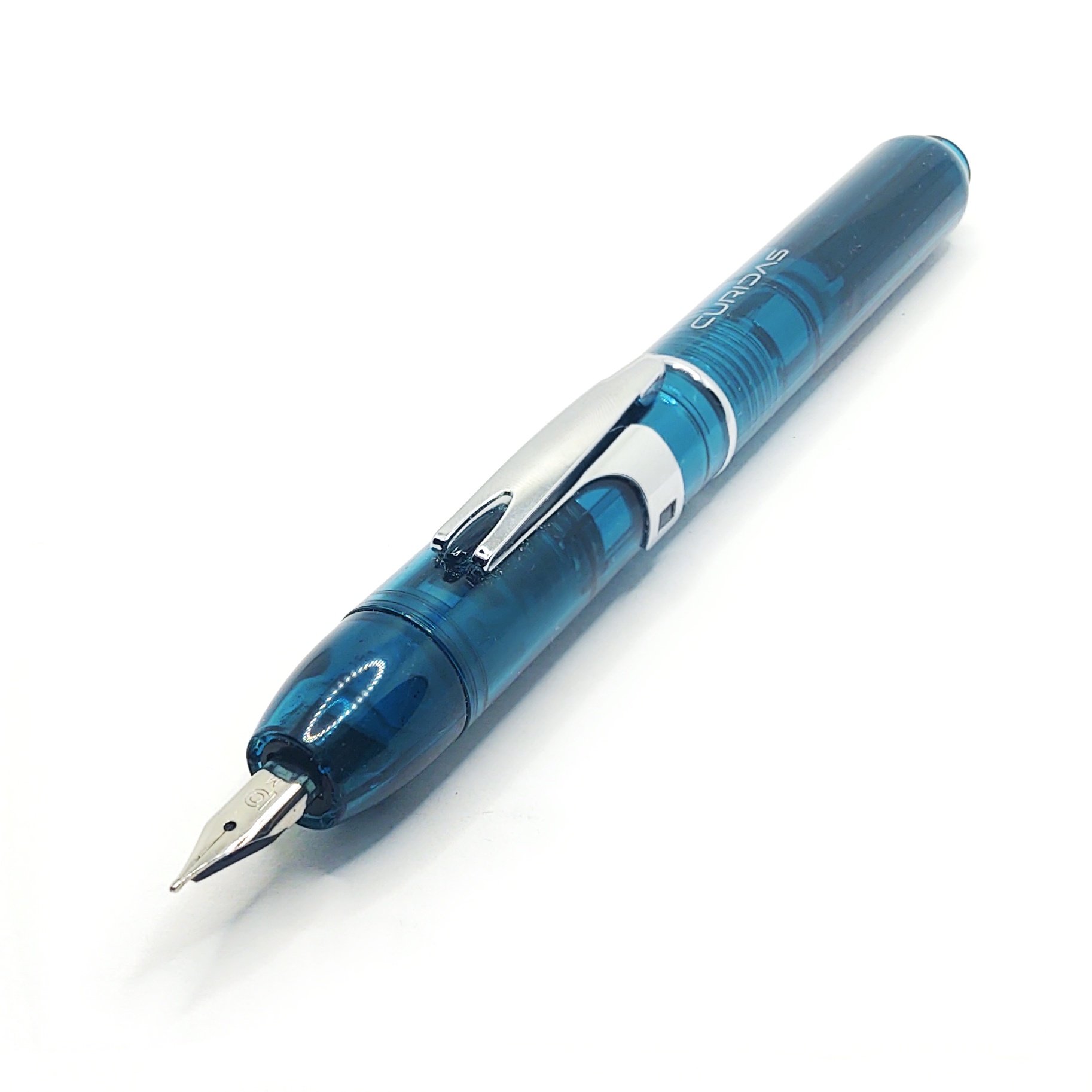
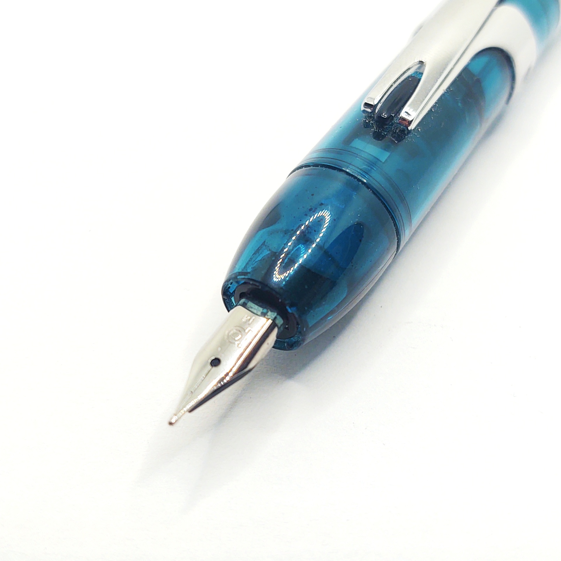
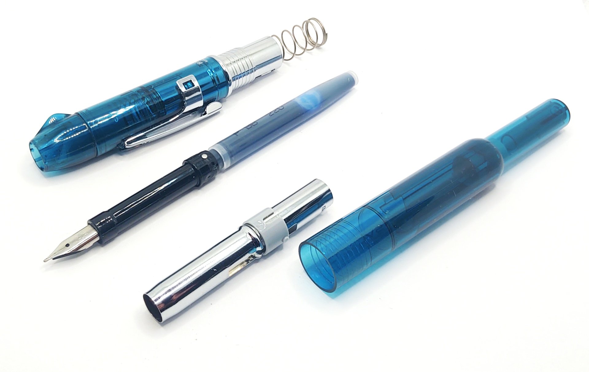
Po'tD 2024-03-16: Platinum Curidas
Alright, kiddos. Play time is over. And by "over," I specifically mean the opposite of that, and it's time to play with pens and photography equipment.
So today I got out four things, if we're counting. Thing one is my illuminated photo box. That's right, this time y'all get to float in the Infinite Expanse. And two stacked macro focus shots. Luxury!
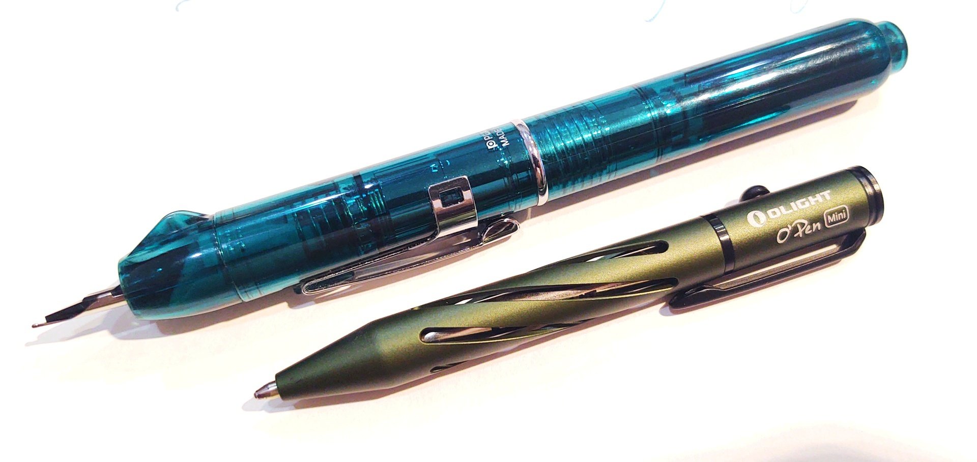
Thing two is the Platinum Curidas, with a medium point and in "Urban Green" which is really more of a translucent turquoise. The Curidas I think at the moment is my favorite retractable fountain pen -- admittedly, out of an available selection of not very many. Other contenders I can think of off the top of my head are the Pilot/Namiki Vanishing Point and Decimo, which I have; the Mahjohn A2 Press, which I also have; The Lamy Dialog, which I don't. Oh, and also these things, which are ubiquitous, but crap. Jury's out on the Oaso K016, which I haven't seen in person yet. I can neither confirm nor deny whether I have one of those coming in the mail already.
Where was I? Oh yeah.
Here's the Curidas' party trick:
It goes blep. It goes un-blep. Click the rather long plunger on the tail and the point retracts into the body. A trap door closes over it, obviating the need for a cap.
Platinum make a lot of noise about the Curidas being the successor to their "Knock" pen from the 1950's, which is now an utter hen's tooth. You're unlikely to get your hands on one of those.
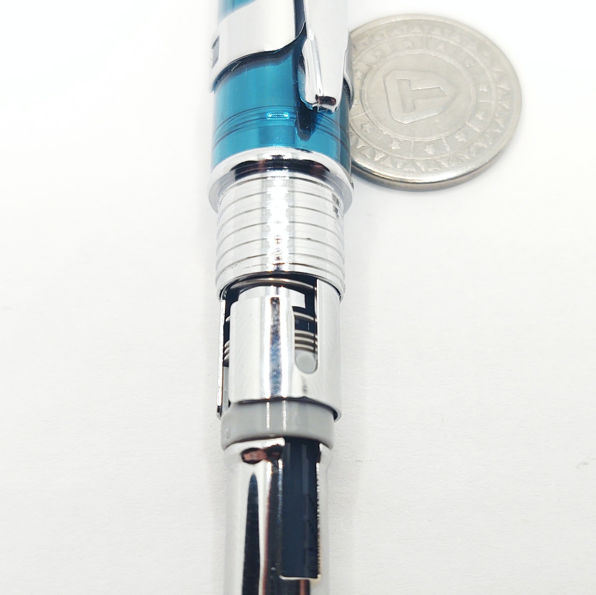
If you're a habitual disassembler, the Curidas has you covered. It breaks down into this selection of components (and you can pull the spring out as well). The clip is removable and my pen came with a little tool in the box to assist with this, which wasn't immediately evident because all the instructions were in Japanese.
The engineers who designed this are surely showing off, because it has not one but two bolt action mechanisms inside, both of which are arguably unnecessary. The first is the bolt-and-twist to remove the metal sheath over the cartridge:
And the second is another bolt-and-twist to insert or remove the nib/cartridge/feed assembly into the nose of the pen:
Never mind the coin. I was just using it to keep the round parts from rolling away.
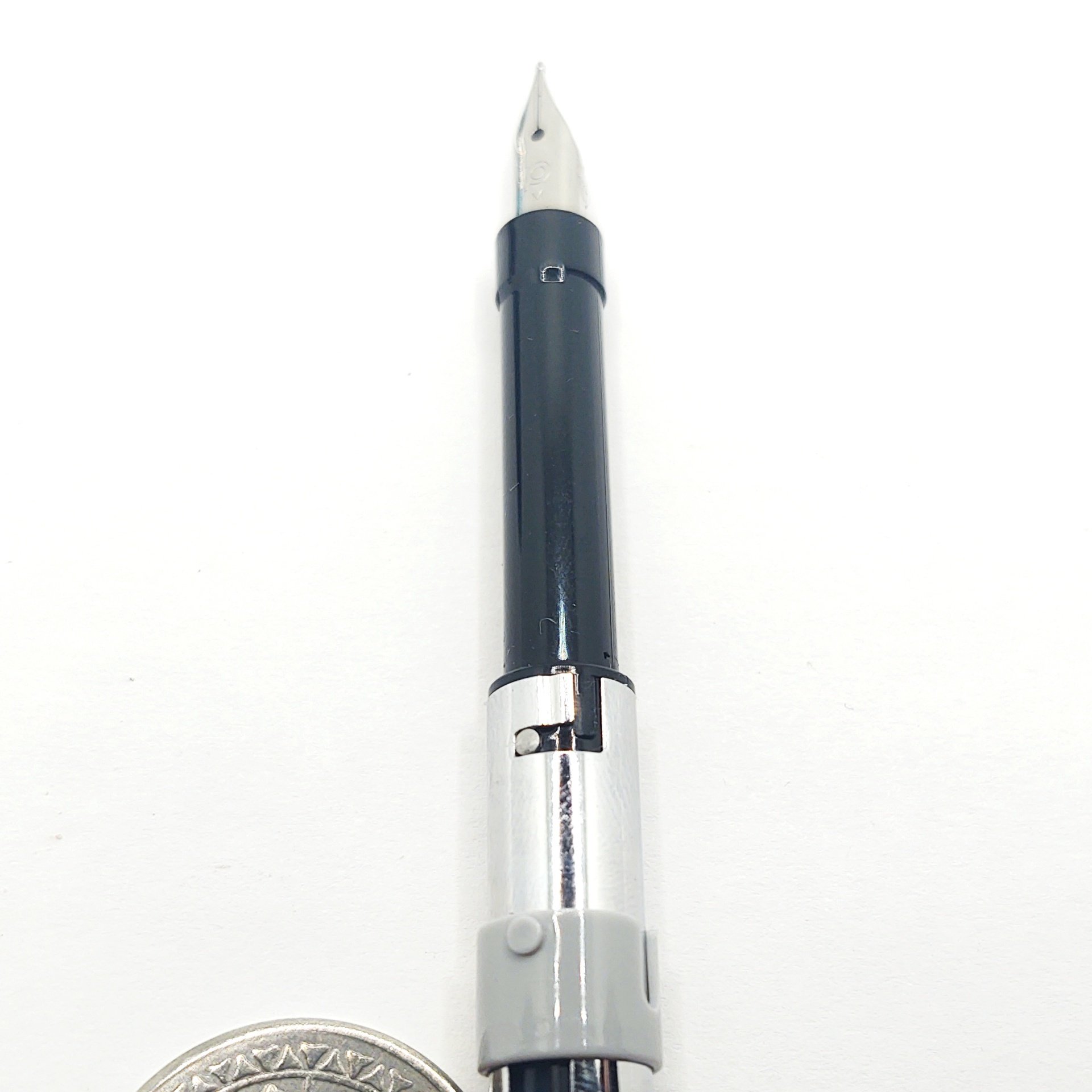
The nib is steel and it's pretty stiff. Very little of its length is not supported by the feed beneath. If you like a flexy bendy line-width-changy feel the Curidas is probably not for you. The "medium" nib is in fact the widest, and it's a little fine even for me. I like a nice bold in-your-face line, which is why I usually write with an italic nib anyhow. Available sizes are medium, fine, and extra fine. I would probably find the latter two nigh unusable.
The Curidas is not an expensive pen, at least compared to its other name brand retractable brethren. You can score one for a little over $40 from all the usual suspects. Compare to $160-ish for a Vanishing Point or over $300 for a Dialog and you can see how having a humdrum nib on it can be excused.
Thing the third.
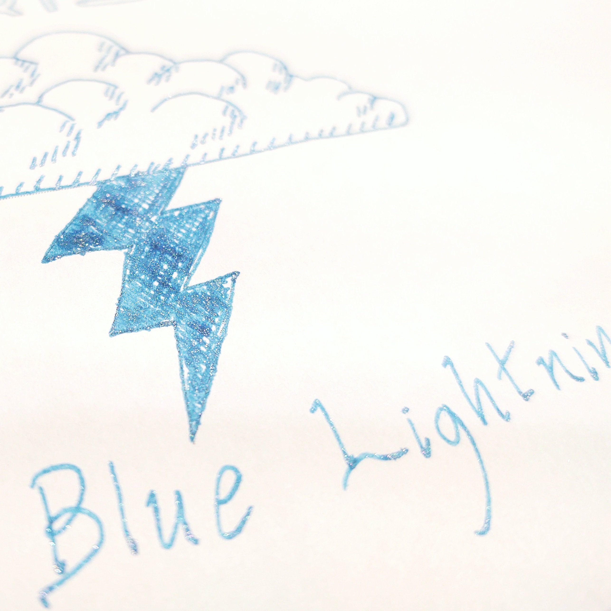
Look, fancy inks are problematic for me. I almost exclusively use my writing tools in a professional environment, so I can't deviate too far from somber and stolid blacks, blues, and just barely maybe some greens. I got this Diamine Blue Lightning shimmer ink in the mail the other day and this is really about as far as I can go in the vibrancy department.
I like this stuff in theory, even though I've only been using it for a single day so far. Out of the Curidas and its little nib the effect is really more sparkly than "shimmer," but maybe it'll do better once I put some of it into one of my calligraphy pens.
Thing the fourth is today's Bonus Ballpoint, which is an OLight O'Pen Mini. This is a compact bolt action ballpoint writer with an aluminum body, here in anodized forest green. This is aimed squarely at the EDC crowd. It's pleasing to fiddle with, a diminutive 3-1/4" long, and if you hand it to a member of the unwashed masses they're unlikely to manage to fuck it up.
At work I always have two pens. I keep a ballpoint or rollerball or something handy because you should never, ever hand one of your fountain pens to a client, stranger, or layman because they're likely to do something to it you'd rather they didn't.
-
Ugly Pens: Rotring Core
Look at it! Behold the butyl overmold on the comically oversized cap! See the screen printed lines like a 90s basketball sneaker! Feel the forced ergonomics of the weird section! Examine the submarine portholes of an ink view window!
…It actually writes okay though. Rotring made good nibs.
-
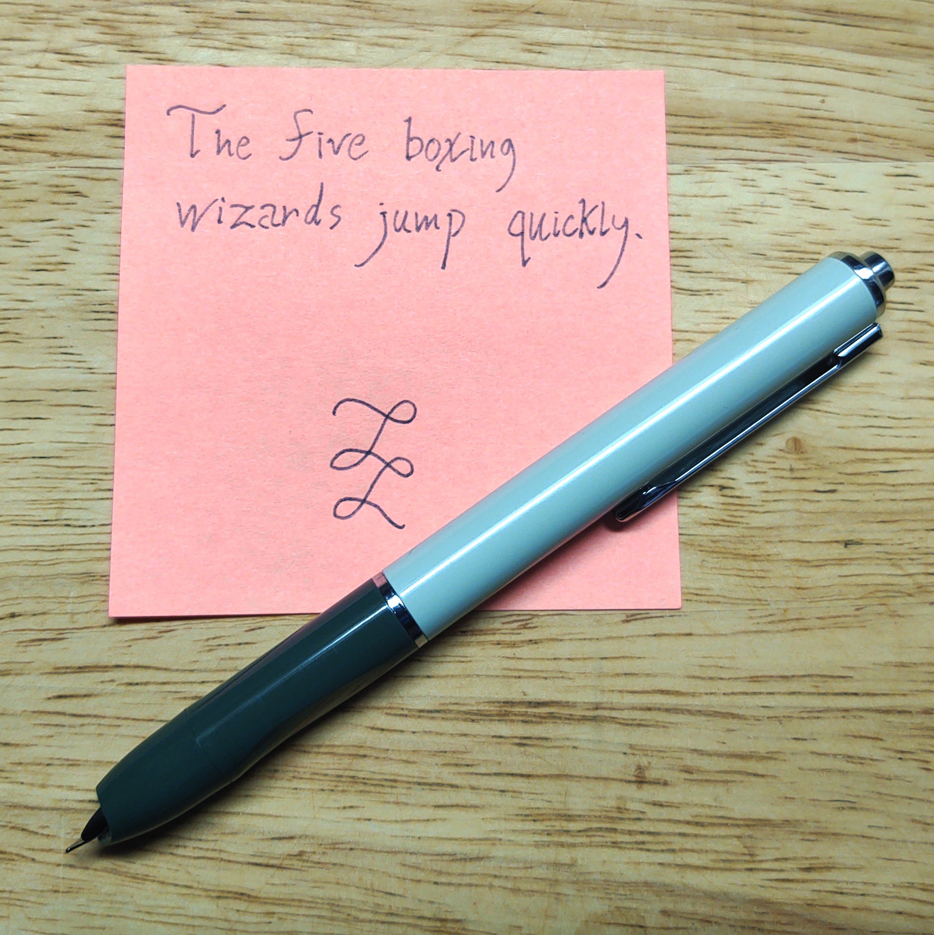
Po'tD 2024-03-14: The Five Below Pen of Unknown Provenance
Spring is here, the air is clear, and the boid is on the wing. So here's a pen that's cheap and absoid, a pastel plastic thing.
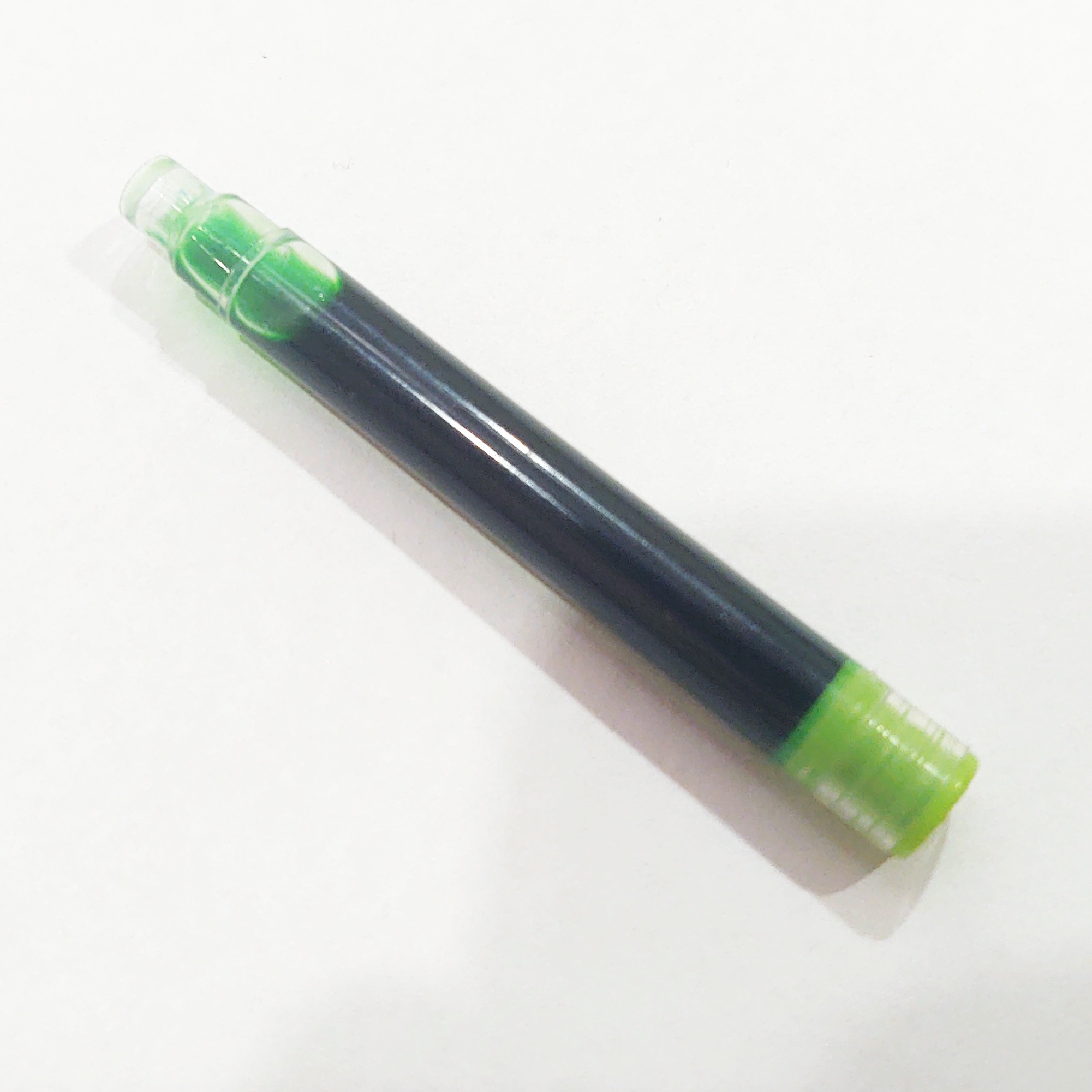
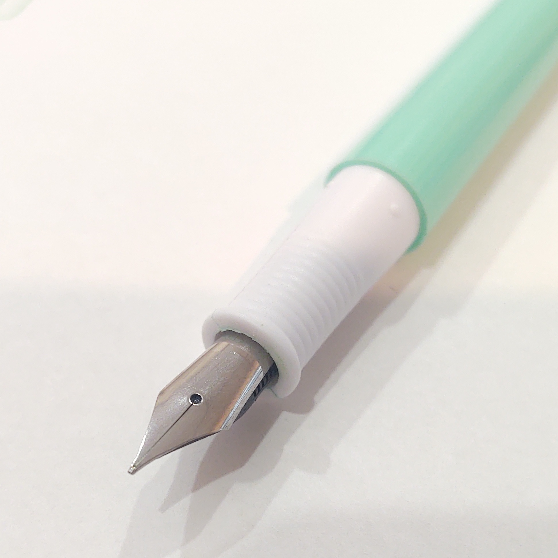
It is the first warm spring day of the season, so on a lark (ha) I grabbed this out of the Pen Bucket. These don't even get a slot in my pen holder. I bought this as a pack of I believe eight at Five Below for $5. They came in all different pastel colors, but among them this green one is the superior choice. Each was included with a cartridge of different colored inks roughly matching the color of the pen bodies, which is watery and very transparent, and comes in a cartridge style I don't recognize:
As before these are all taken in my office at work which has terrible lighting for photography. Sorry about that.
The exposure didn't do it justice, but the ink this came with is a very transparent, very light sort of plastic-easter-grass green.
All eight or however many came in the pack have these same unremarkable steel nibs which, if we're keeping score, would probably be called a "medium." They're not terribly nice, but they do write albeit with some skipping if you're fast and not careful (visible in my headline picture). Neither the pen, nor the nibs, nor even the packaging bore any kind of brand name or maker's mark aside from "manufactured for Five Below." It did not go as far as to specify by who. We'll probably never know.
The bodies are all injection molded and if I had to guess I'd say they're ABS plastic, complete the world's most Fisher-Price cap and pocket clip. The clip is molded in, not terribly well designed, nor is it removable. When it breaks, that'll be it. The knurled part on the end looks like it should unscrew but it doesn't. Curiously, the cap does not have an anti-choke hole. But the pen body does. (Obviously putting an anti-choke hole in the cap of a fountain pen would be a dumb idea, but that hasn't stopped manufacturers of cheap and nasty examples from doing so anyway either via the old monkey-see/do or possibly out of an overabundance of caution, and with predictable results.)
But as the refrain goes -- whaddaya want for 63 cents each?
Bottom of the barrel: Scraped!
-
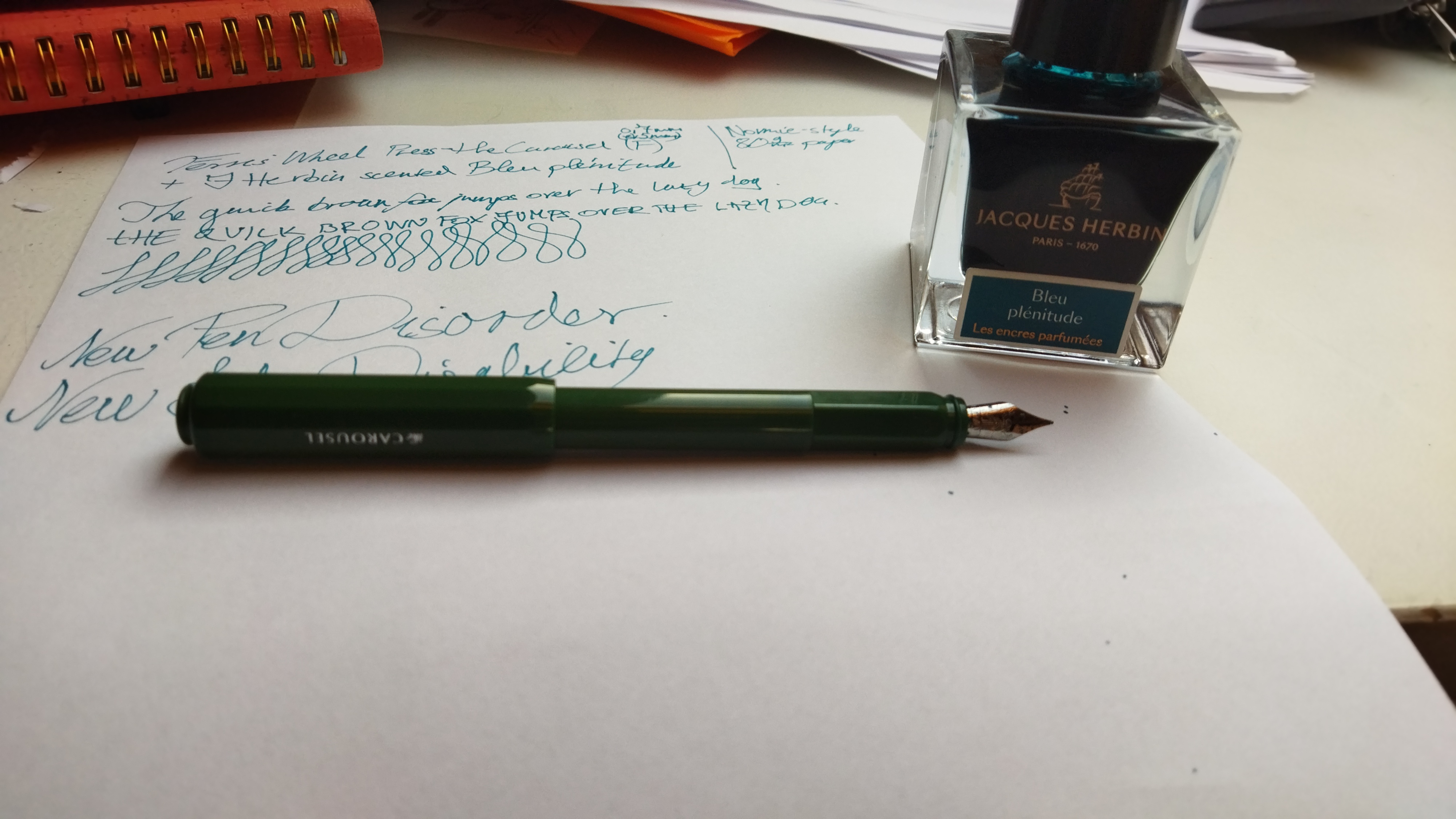
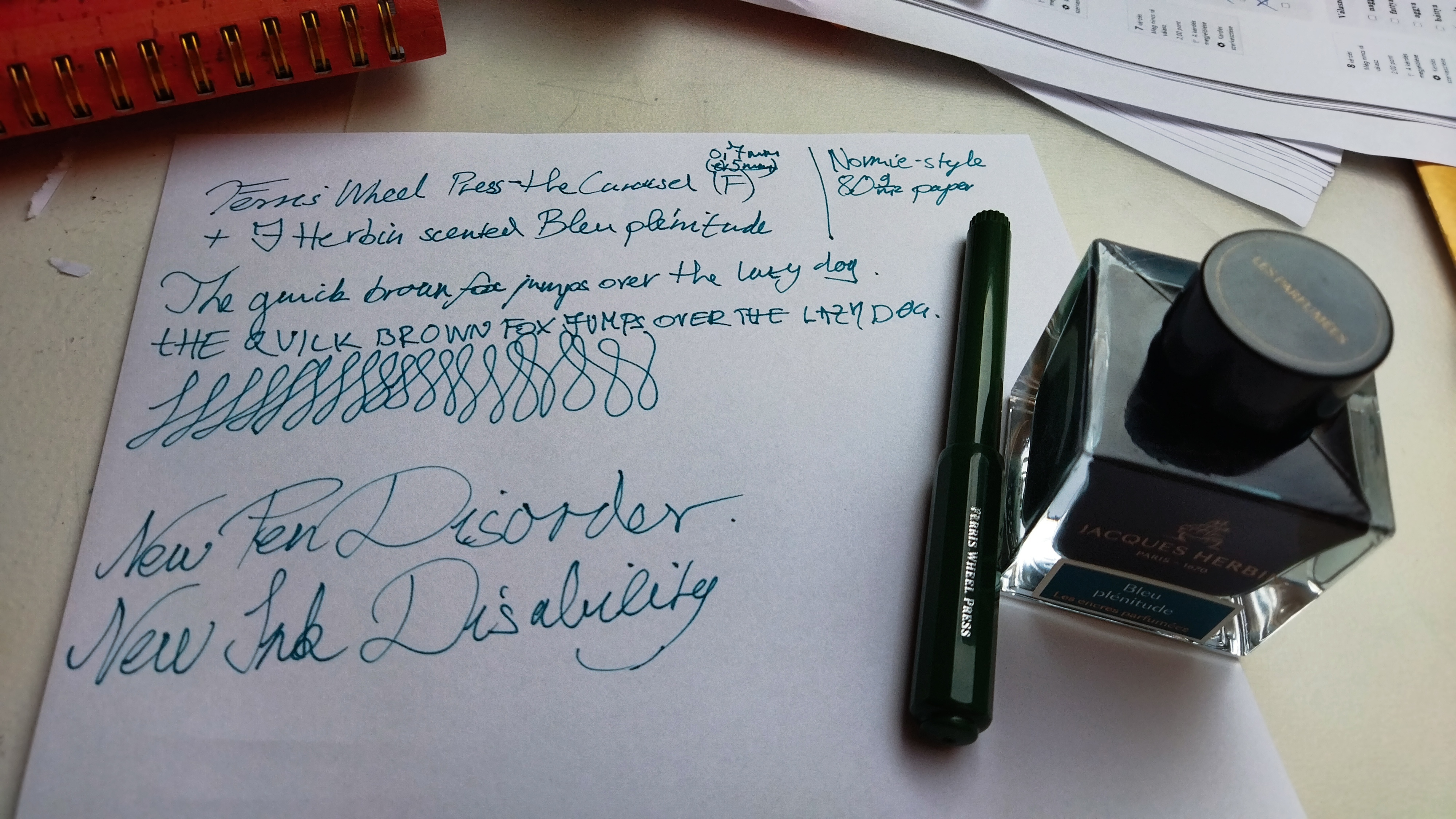
2024.03.14
- FWP Grand Central Skies / Safari M
- Iroshizuku Suo-Ro / Sport B
- Diamine Havasu Turquoise / Safari F
- Diamine Apple Glory / Safari M
- "Just Blue" / Lilliput F
Love the way GCS shimmers.
A CCR quote, and a few words of a certain classic twenty-five minute Arlo Guthrie song.