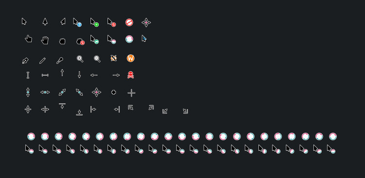
This week in KDE: we modernized the breeze cursors, created a new banner component and released a "KDE For Travelers" webpage.
This week in KDE: we modernized the breeze cursors, created a new banner component and released a "KDE For Travelers" webpage.


This week in KDE: we modernized the breeze cursors, created a new banner component and released a "KDE For Travelers" webpage.
https://pointieststick.com/2023/07/07/this-week-in-kde-akademy-approaches/
You're viewing a single thread.
All Comments
14 comments
@[email protected] @[email protected] what's up with the default cursor's bottom part having a thicker outline than the rest of the cursor? looks weird...
2 0 Reply@rnd @[email protected] @[email protected] I actually kinda like it, gives some 3D vibes, though it would be nice if it was consistent with the other cursors
1 0 Reply
14 comments
Scroll to top