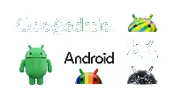
A new modern look for the Android brand
A new modern look for the Android brand
blog.google A new modern look for the Android brand
This evolution of our visual identity better represents Android’s core ethos of being open, iterative and inclusive — and it’s fun, too.

The bugdroid is now in 3D lol
You're viewing a single thread.
All Comments
42 comments
I‘m all for a return to a more 3D look and feel, skeuomorphism etc. But those just look… off.
11 2 Reply
42 comments
Scroll to top
