idkbin 1.3.7 - A few small changes to make kbin look a tad better
idkbin 1.3.7 - A few small changes to make kbin look a tad better
After seeing all of the cool userstyles on here, I decided I'd have a go at learning some CSS and making a userstyle myself.
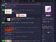
Here's an example of what it looks like.
I'm pretty new to this stuff, so feedback is very appreciated.
1.0.0
- Thumbnails are on the left of threads instead of the right.
- Media previews are more limited in height.
- Media previews are better integrated with their articles.
- Favorites (upvotes) and reduces (downvotes) have more contrasting colors.
- The boost button turns yellow when clicked.
- The magazine name in the header is colored magenta.
- Magazine names are more consistently bolded.
- Pinned posts are distinguished with a magenta outline.
- Links and buttons have a smoother transition when hovered over.
- Magazine icons are square and smaller.
1.1.0
- A ton of different settings are now available (e.g., toggling features, changing colors).
- The subscribe button is magenta when clicked.
- The block button is red when clicked.
- Your username is colored yellow on your posts and comments.
- (Disabled by default) The magazine name on the sidebar is magenta.
- (Disabled by default) Inline magazine names are magenta.
1.1.1
- Magazine icon size can now be changed in settings.
- Whether the magazine stretches with its icon size can be toggled in settings.
1.2.0
- The code is (hopefully) compatible with the layout changes rolled out on July 5.
- The search and add post buttons now have text.
- Image previews have a darker background.
1.2.1
- The darker background for image previews differs depending on theme.
1.2.2
- In the comments of a thread or post, OP's username is colored magenta.
- The text for the search and post icons are properly aligned.
- The select channel icon is properly aligned with the other icons.
1.2.3
- The show preview button is now colored.
- (Disabled by default) The blurred background of thumbnails can be removed.
1.2.4
- This style's image preview changes now work with the new kbin update.
- The user follow and user block buttons are now colored when clicked.
1.2.5
- The text in crossposts is no longer shifted to the right.
- The tops of image previews are no longer slightly cut off.
- Empty image previews no longer lead to weird thread border stuff.
1.2.6
- The new comment marker has been tweaked to work with rounded edges.
- The new comment marker has been recolored.
- Comments by OP now have a correct left border corresponding to the comment level. [Default Kbin styling has a special border for OP comments, but idkbin disables this since the name is recolored instead.]
1.2.6.1
- Your own comments now have a correct left border corresponding to the comment level. [Default Kbin styling has a special border for your comments & threads, but idkbin disables this since the name is recolored instead.]
1.3.0
- Sort options on thread pages and tabs on the magazines/collections page now have icons.
- The boost button now has an icon.
- The show preview button has been tweaked to look more like a button and is now colored when the preview is active.
- The collection subscribe/favorite button is now colored when clicked.
- Official collections now have a checkmark next to their names.
- Danger buttons (e.g., account deletion, collection deletion) are now recolored.
- The new comment marker has been tweaked to work with rounded edges.
- The new comment marker can be recolored.
- Comment lines are now solid and slightly thicker.
- There is now a comment line for descendants of first-level comments.
- Toggles and color settings for all of the above have been implemented.
- Image previews are now clipped by the bottom rounded edges.
- Upvote & downvoting recoloring can now be toggled.
- The smooth fade added to many elements by this userstyle can be toggled.
- A bug has been fixed which caused fades on different parts of an object to not occur at the same time.
- The text next to the search and add icons in the header are now disabled by default.
- Probably some other stuff I forgot.
1.3.1
- Sort option icons have been added to places where they were missing (e.g., comments, microblog feed).
- The tabs on the activity bar (boosts, reduces, and favorites) now have icons.
- The scroll-to-top button has been tweaked. This can be toggled in settings.
- The scroll-to-top button now fades in and out when the Smooth Fade setting is enabled.
- Layer shenanigans caused by my braindead solution to cleaning up the first comment line have been fixed. Hopefully what I have now works as it should.
1.3.2
- Users with no avatar now have an icon in comments instead of an empty box. This can be toggled in settings.
- An oversight has been corrected that caused the boosts tab on the activity bar of microblog comments to not have an icon.
- When viewing the activity of a thread comment, there is now space between it and the activity bar to match when you view activity of other things.
1.3.2.1
- Sort option icons now work correctly with the new sort options on user profile pages.
1.3.2.2
- An oversight has been corrected that caused sort option icons to not work correctly on different page numbers.
- An oversight has been corrected that caused official collection checkmarks to be missing in certain places.
1.3.3
- The more button has been replaced with an ellipsis icon. This can be toggled in settings.
- The no avatar icon is now user-large instead of user-large-slash, as the latter would make more sense for a deleted account.
- An oversight has been corrected that caused sort option icons to not work correctly on search and tag pages.
1.3.4
- An icon has been added next to the expand/collapse button on microblog posts. This can be toggled in settings.
- A visual glitch with comments on certain pages has been fixed.
1.3.5
- There are now three options for the microblog post expand/collapse icon: Angles (new default), Carets, or None.
- The comment wrap button now has a new icon. There are three options for this in settings: Angles (new default), Carets, or None.
- There are now three options for the more button icon: Ellipsis, Lemmy, or None.
- The list of boosters in a microblog post now uses a boost icon instead of a plus. This can be toggled in settings.
1.3.6
- The dropdown menus in the header (i.e., the add, channel select, and avatar menus) now have icons in them. This can be toggled in settings.
- The "None" option for the comment wrap button icon setting has been renamed to "Default".
1.3.7
- The dropdown menu from the more button now has icons in it. This can be toggled in settings.
- The header dropdown menu icons now work with Improved Channel Select Menu for Kbin.
You're viewing a single thread.
5 comments
Thank you very much!
I made a clone for myself with
prefer-color-schemeand colored comment indents.Edit: The colors are based on Quasar.