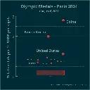
▶️ Total olympic medals per 1k $GDP per capita - Paris 2024 - represented in the Tukey's boxplot 🏅
▶️ Total olympic medals per 1k $GDP per capita - Paris 2024 - represented in the Tukey's boxplot 🏅


▶️ Total olympic medals per 1k $GDP per capita - Paris 2024 - represented in the Tukey's boxplot 🏅
Is the highest number, relative to $GDP per capita, best? Outliers marked as circles. Made in #LabPlot, an open-source data analysis and visualization software.
Edit: the problem is framed as a question.
#Olympics #Olympics2024 #France #China #NorthKorea #USA #UnitedStates #UnitedKingdom #UK #Brazil #Australia #Japan #Italy #Canada #Germany #Spain #DataAnalysis #DataViz
You're viewing a single thread.
How did you make the graph? I am asking because I am currently searching for ways to get into data stuff. Do you have good ressources?
2 0 ReplyWe used #LabPlot, a free, open source and cross-platform data visualization and analysis software.
LabPlot's homepage:
➡️ https://labplot.kde.org/Video tutorials:
➡️ https://www.youtube.com/@LabPlot/videos3 0 Reply